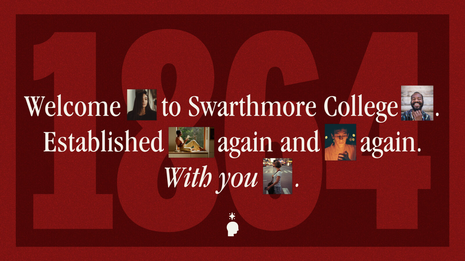
Swarthmore College
Let’s try to avoid the B-word.
Branding. Why does a top-three liberal arts school need it? And how did we help them realize that it wasn’t a word to be afraid of? For a client with a reputation as strong as Swarthmore’s, it’s less about creating something new and more about uncovering authenticity that already exists. This was the first time Swarthmore would embark on a truly comprehensive brand to unite all aspects of the College. Add in Gen Z’s increasing skepticism of being marketed to (plus a healthy dose of Quaker consensus), and we quickly realized this partnership would be one for the books. Er, website.
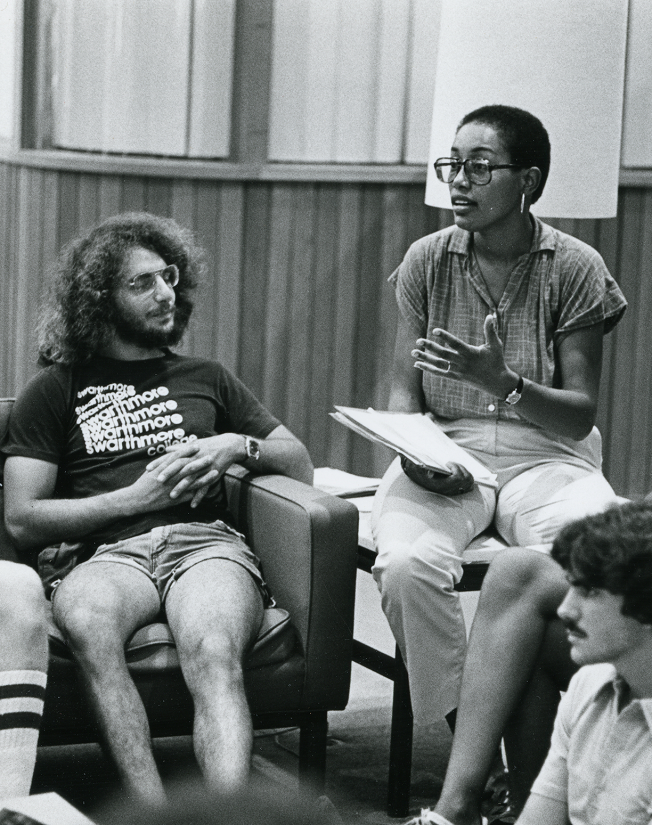
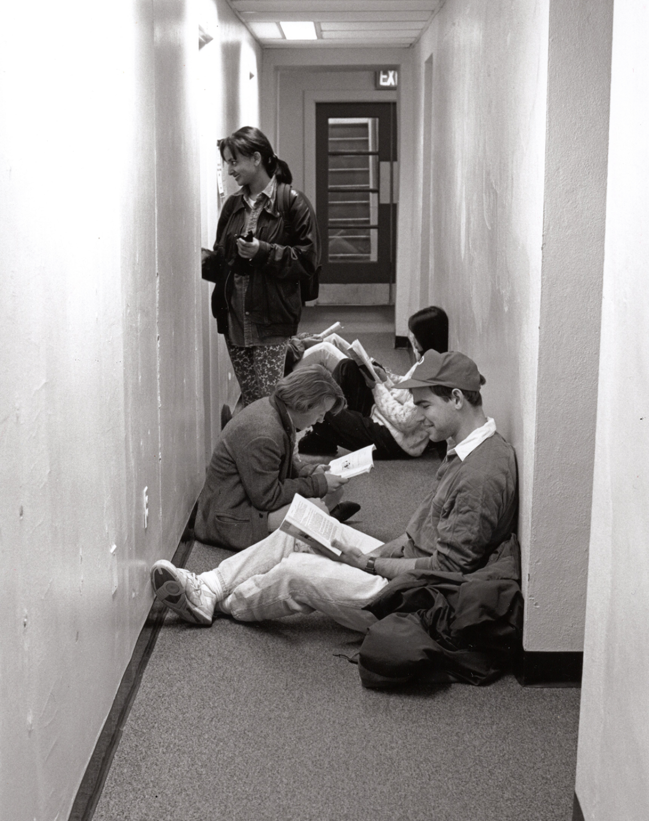
Source: Swarthmore College Archives
Source: Swarthmore College Archives
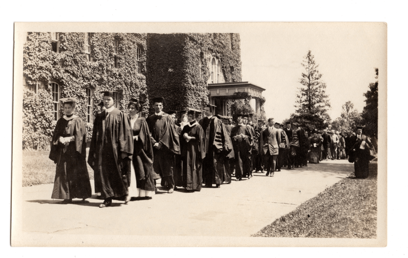
Source: Swarthmore College Archives
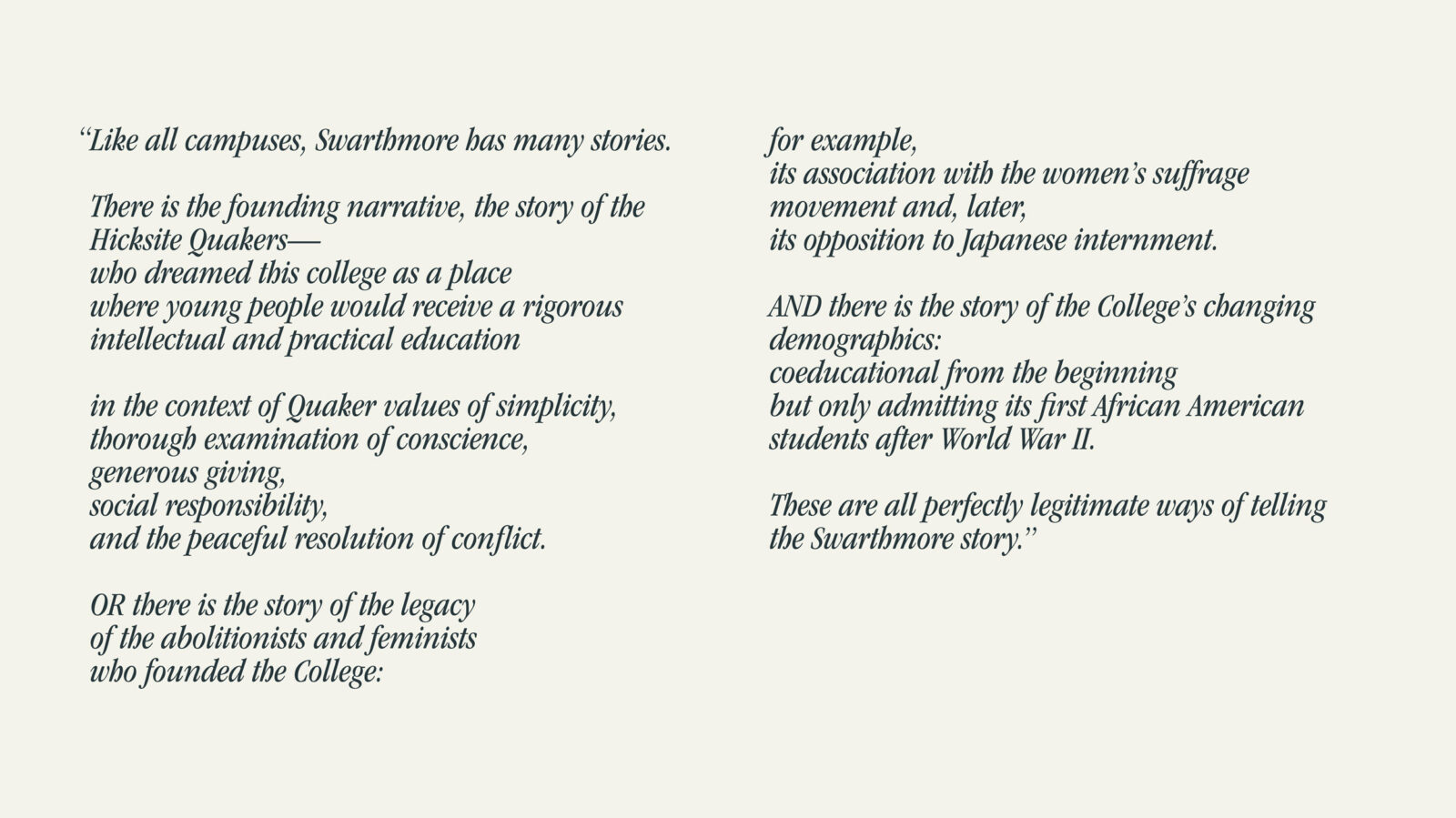
Excerpt from President Valerie Smith's inaugural address
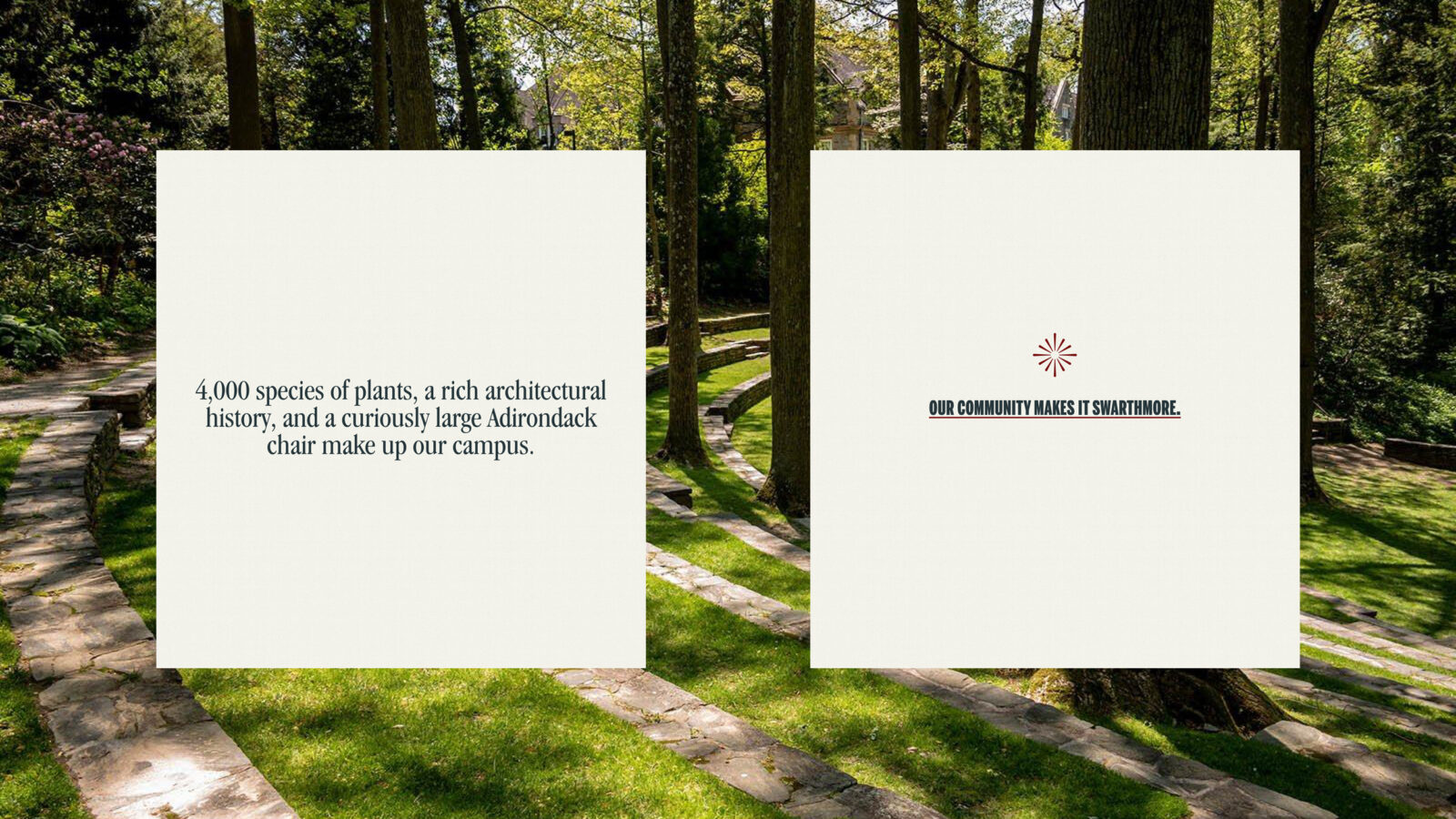
BRAND PLATFORM
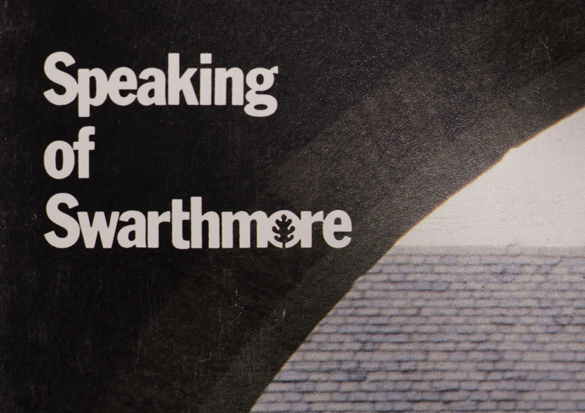
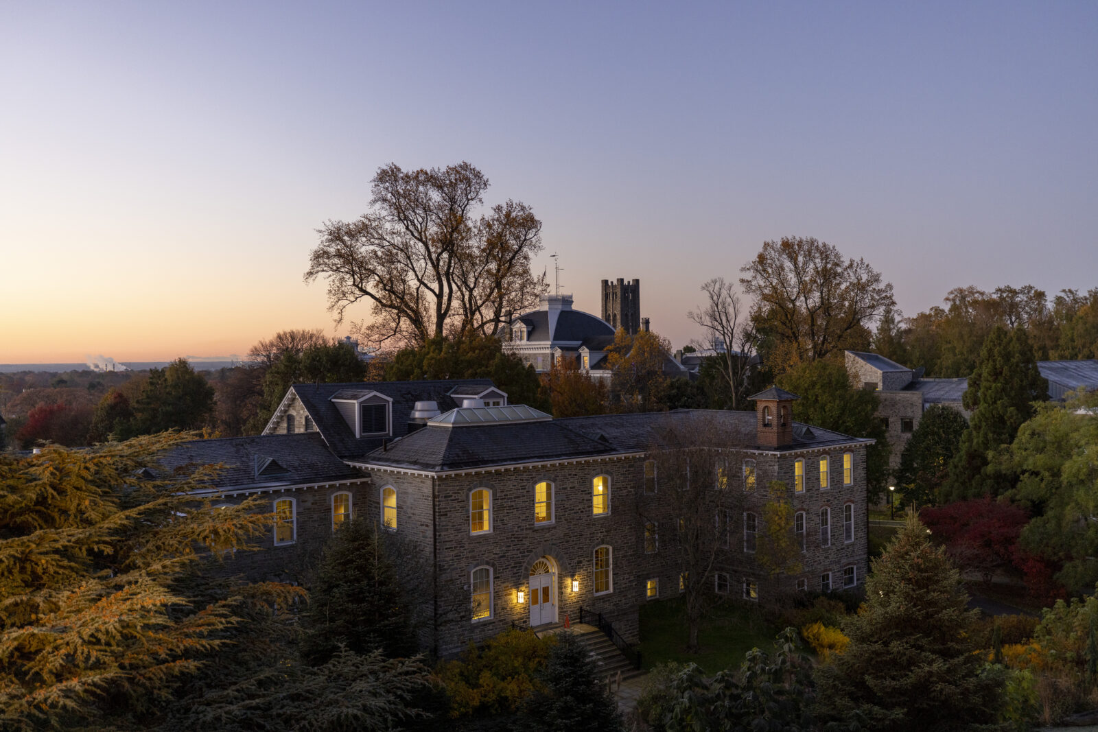
Like usual, our discovery of the place took shape through many, many, many conversations among Friends. But we also found some of our freshest inspirations from more unexpected sources, including dusty archival pages and President Valerie Smith’s inaugural address.
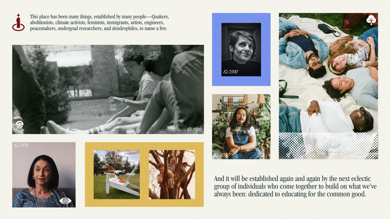
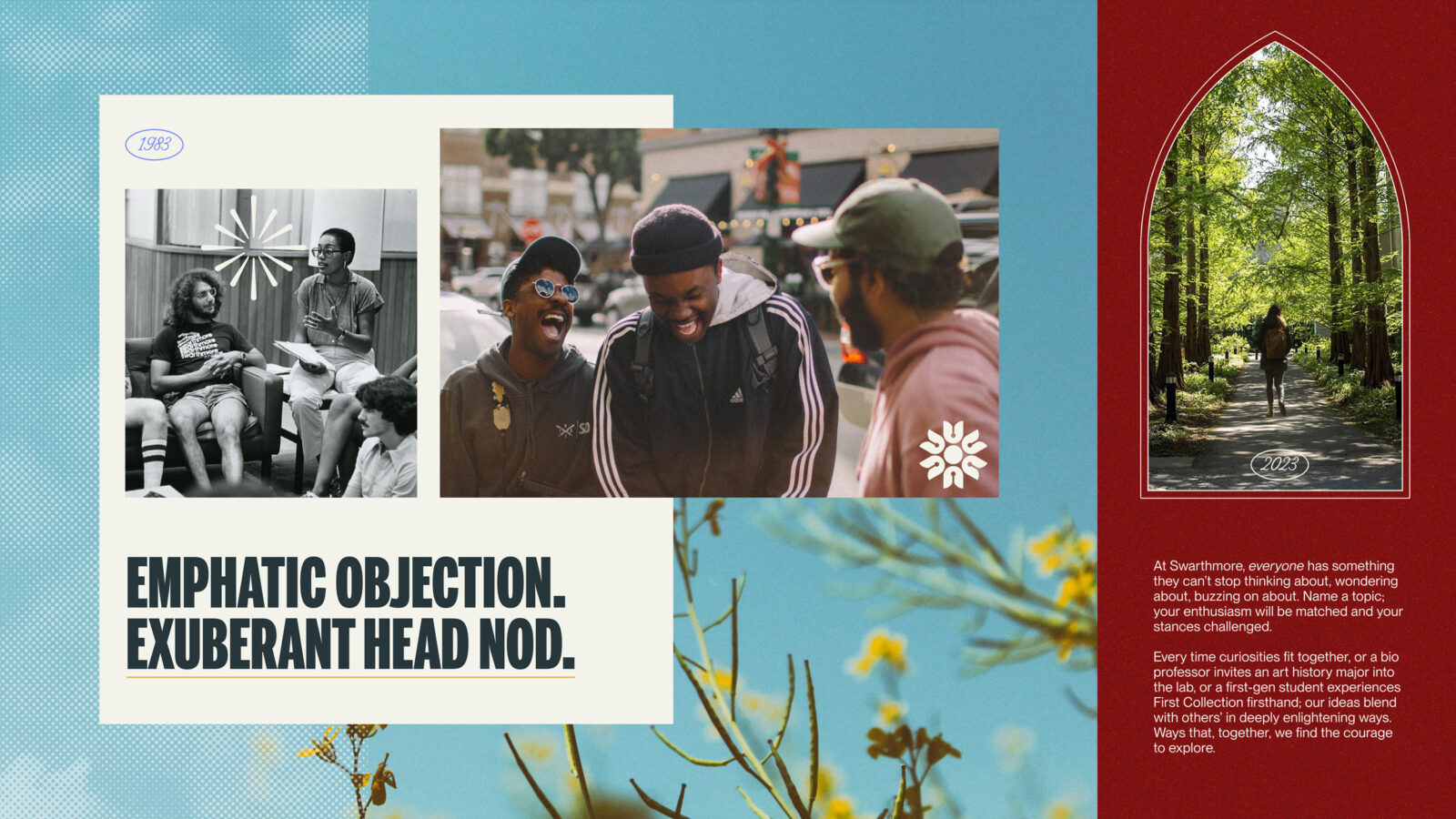
Conceptual Establishing Art


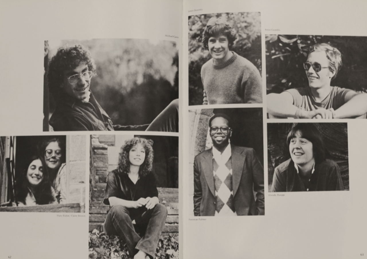
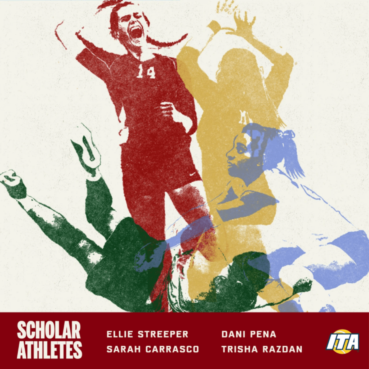
Once we had defined that this was a place made up of many stories, it was time to help Swarthmore start writing some new ones that reflect where they are today. These stories spanned admissions, athletics, advancement, financial aid, a refreshed library of photo assets shot by Truth and Consequences Studios, and more.

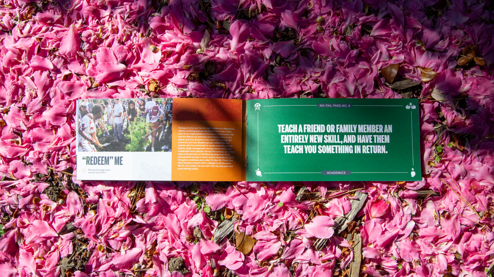


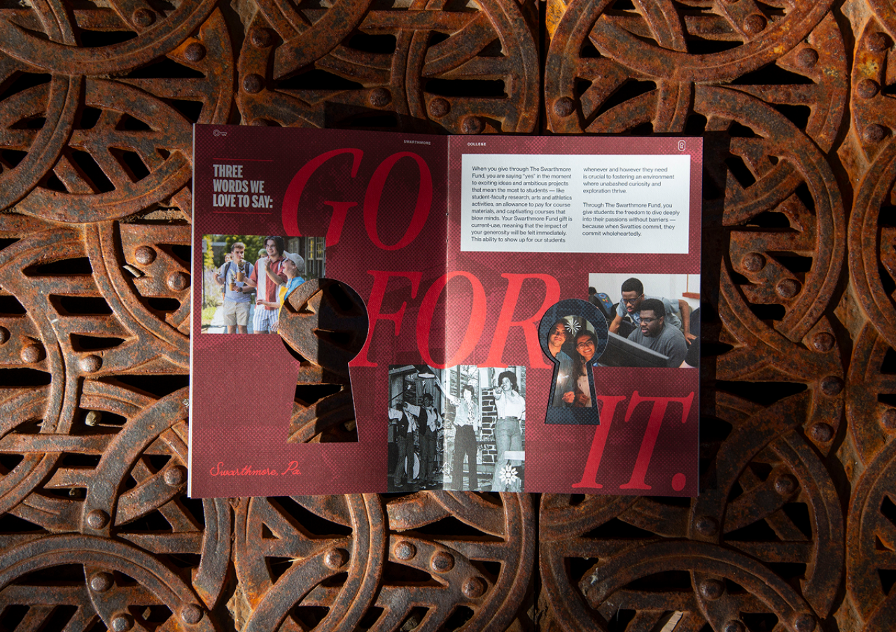
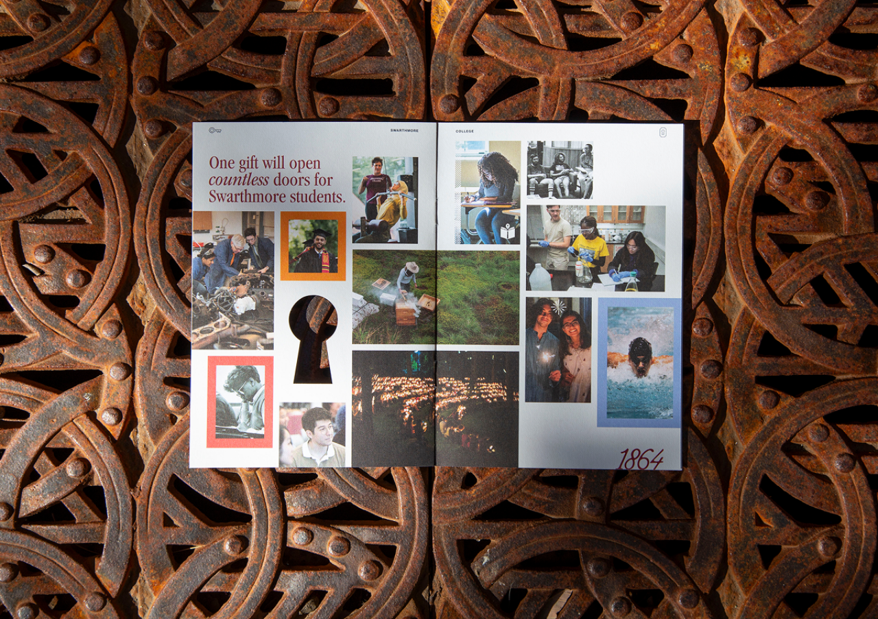


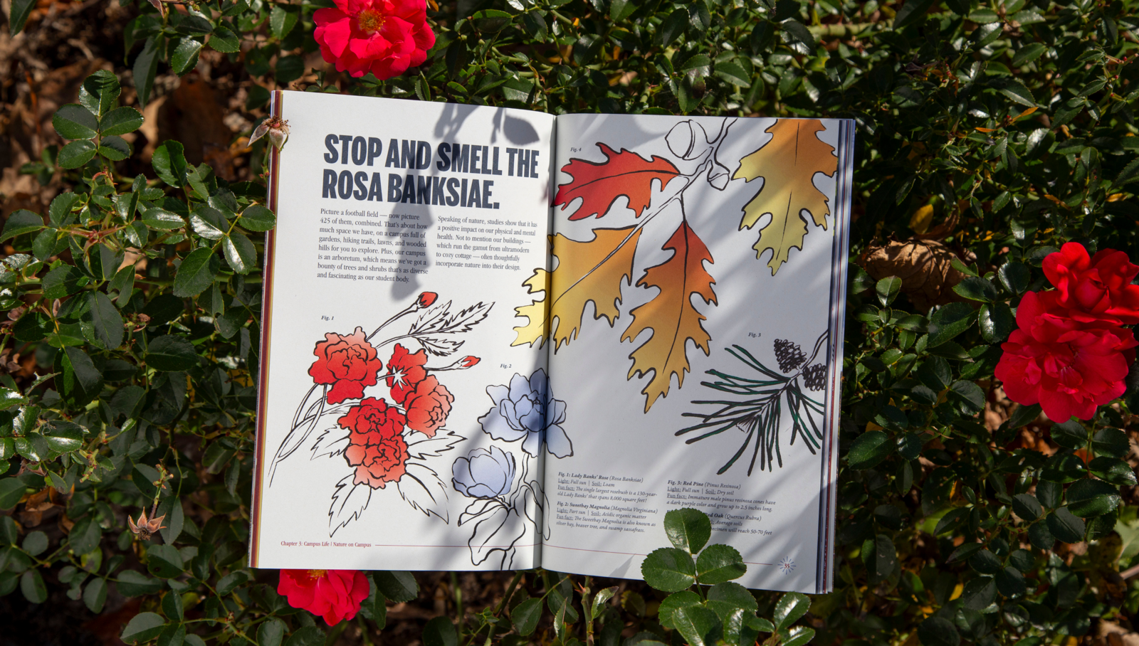
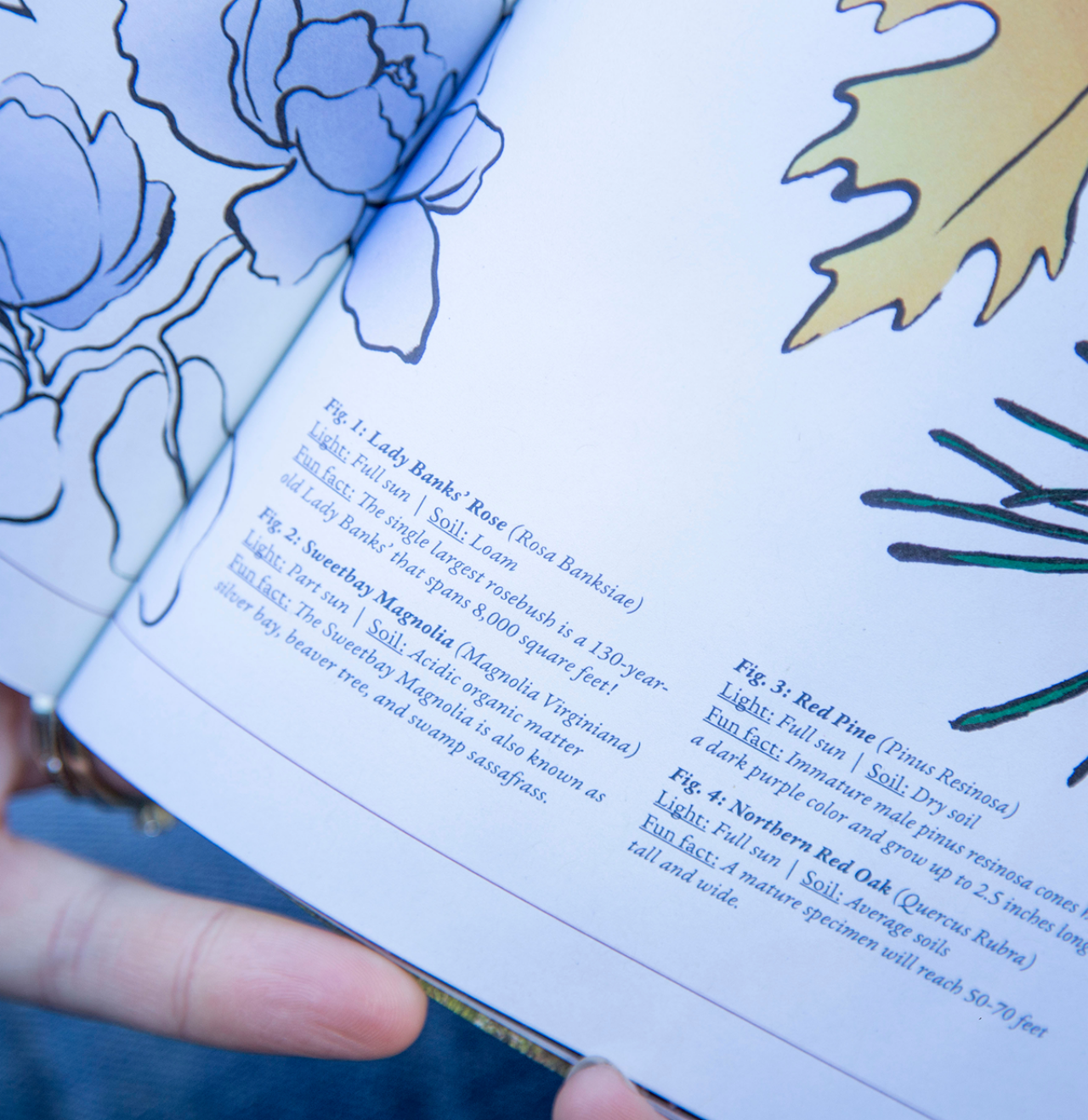
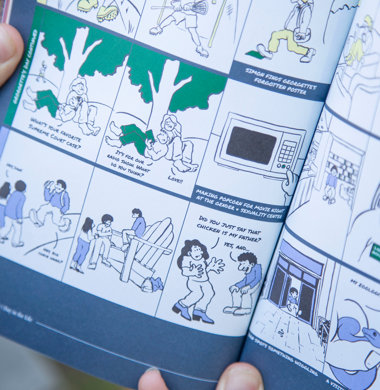
VIEWBOOK
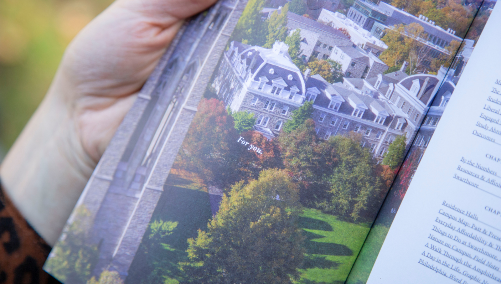
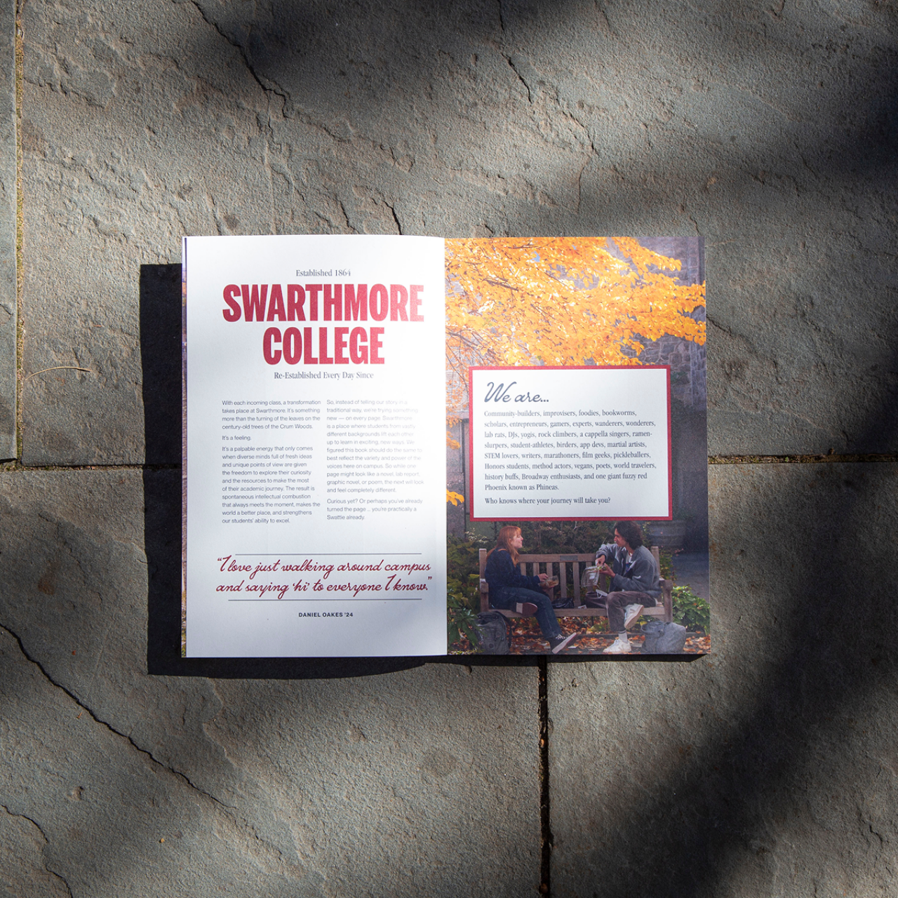
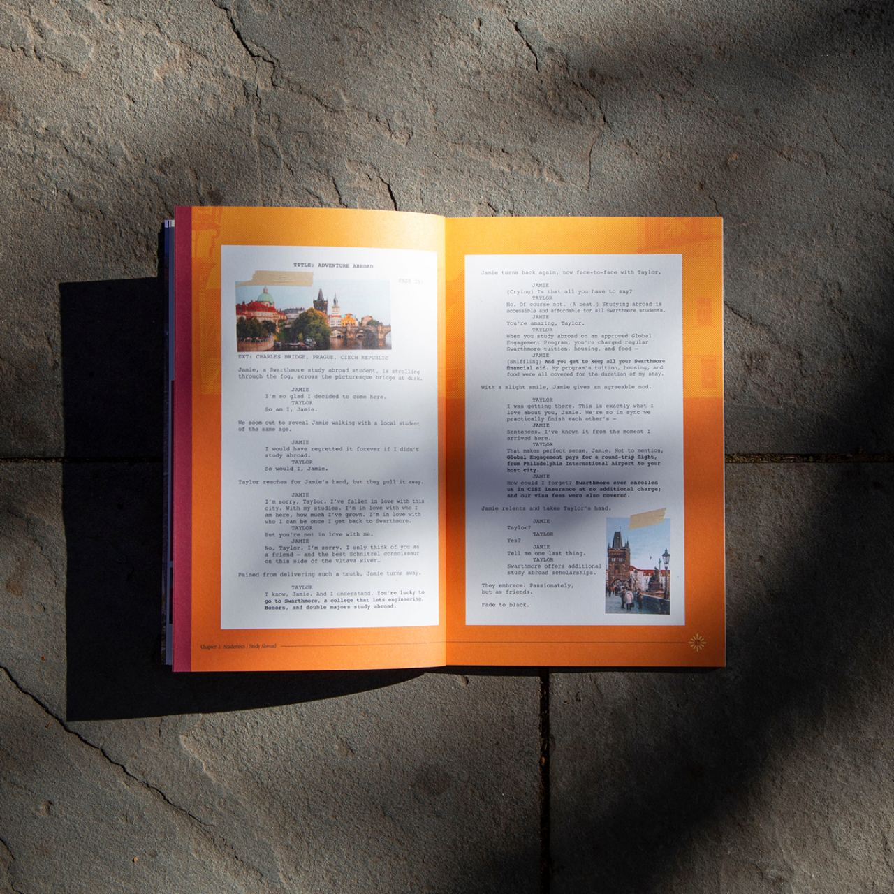
With a new brand in place, we were ready to tackle the viewbook. Drawing on the diversity of the school and of the liberal arts philosophy, content ranged from photo essay to poetry to screenplay to graphic novel over the course of a whopping 64 pages to leave you guessing at every turn. (Don’t worry, we included a bookmark to keep your place—scented like trees, of course.)
2025 Gold CUPPIE Award Winner (Admissions Viewbooks)
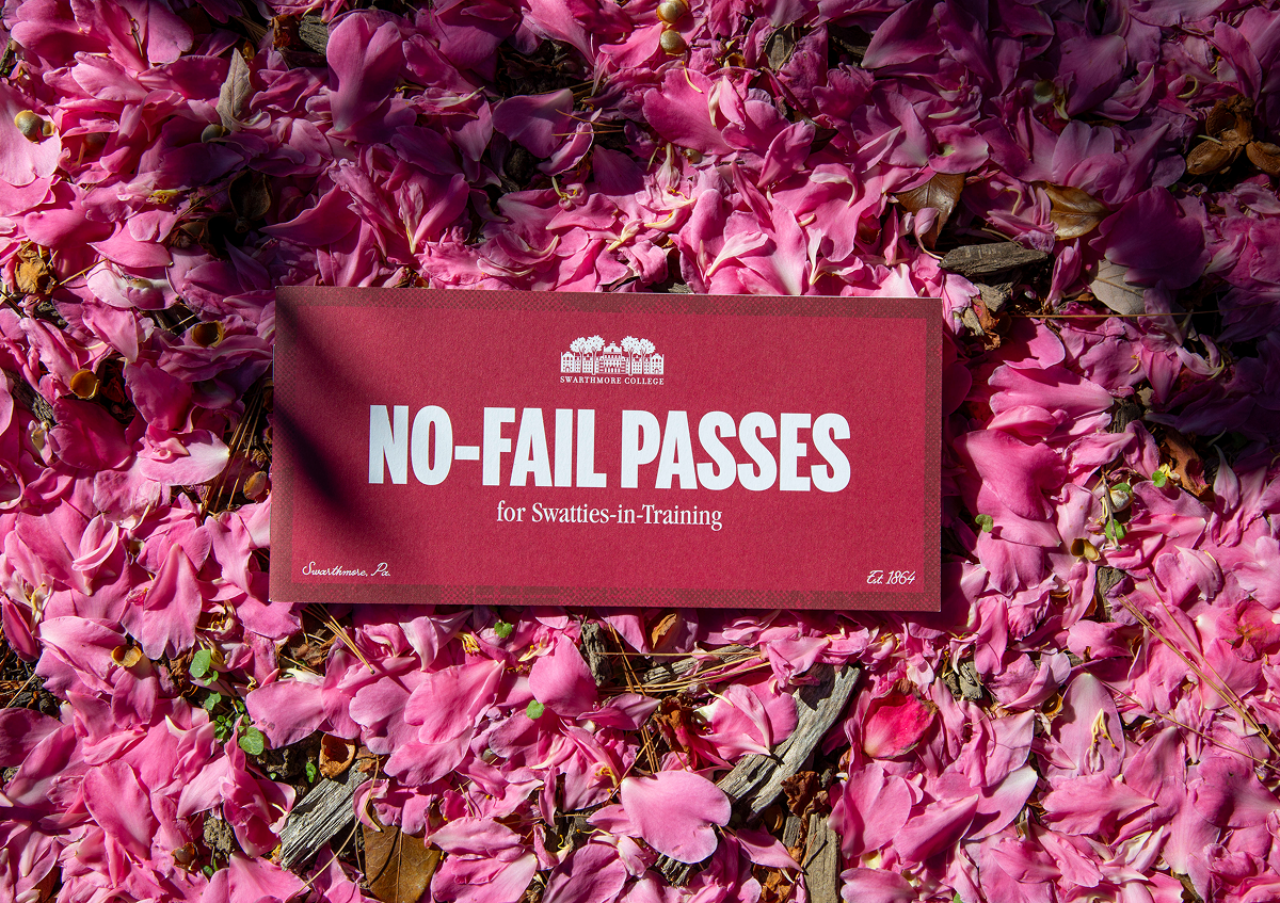
SWARTHMORE B-SIDES
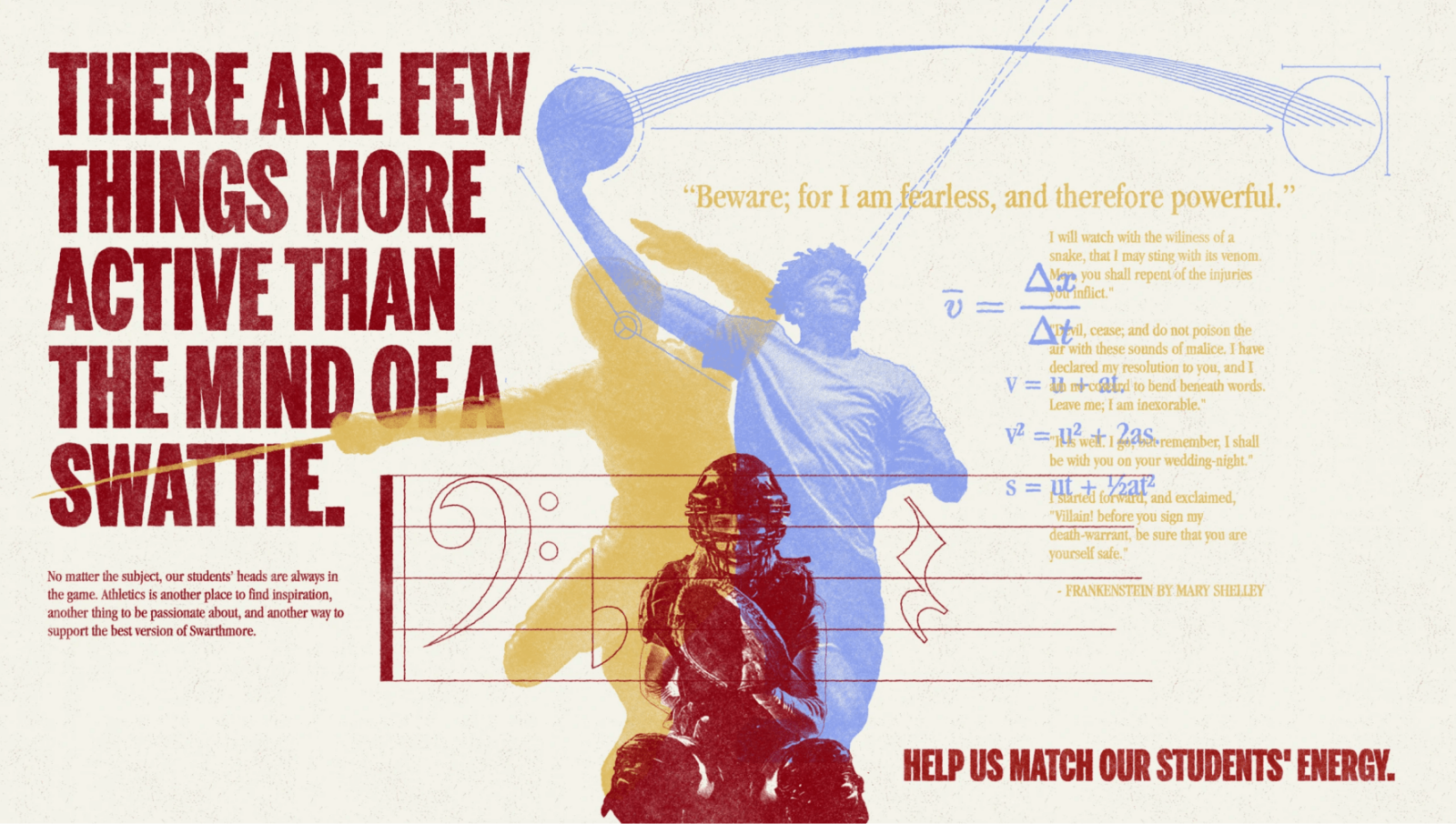
Beyond the main institutional brand, our partnership included a couple campaigns and creative detours.
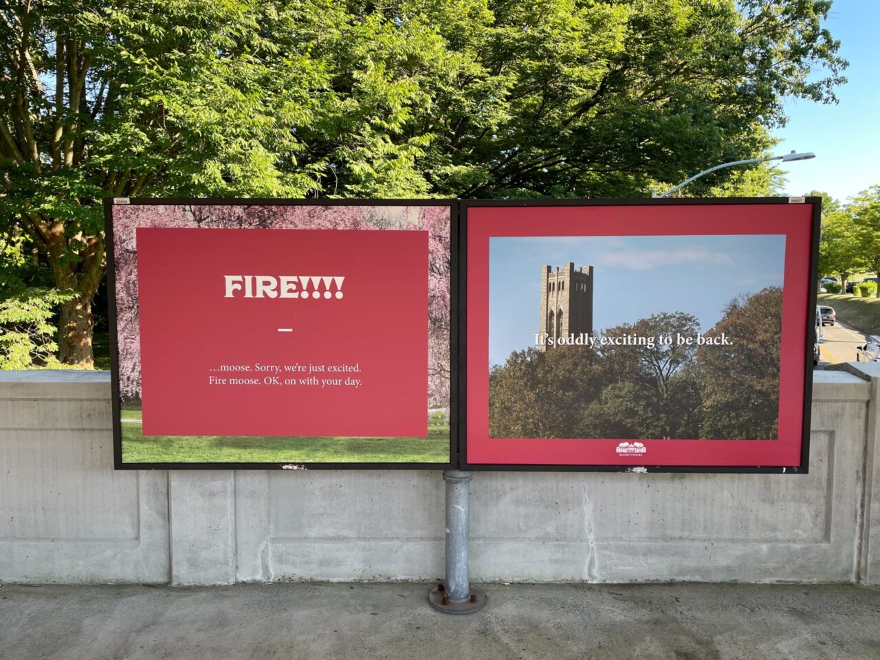
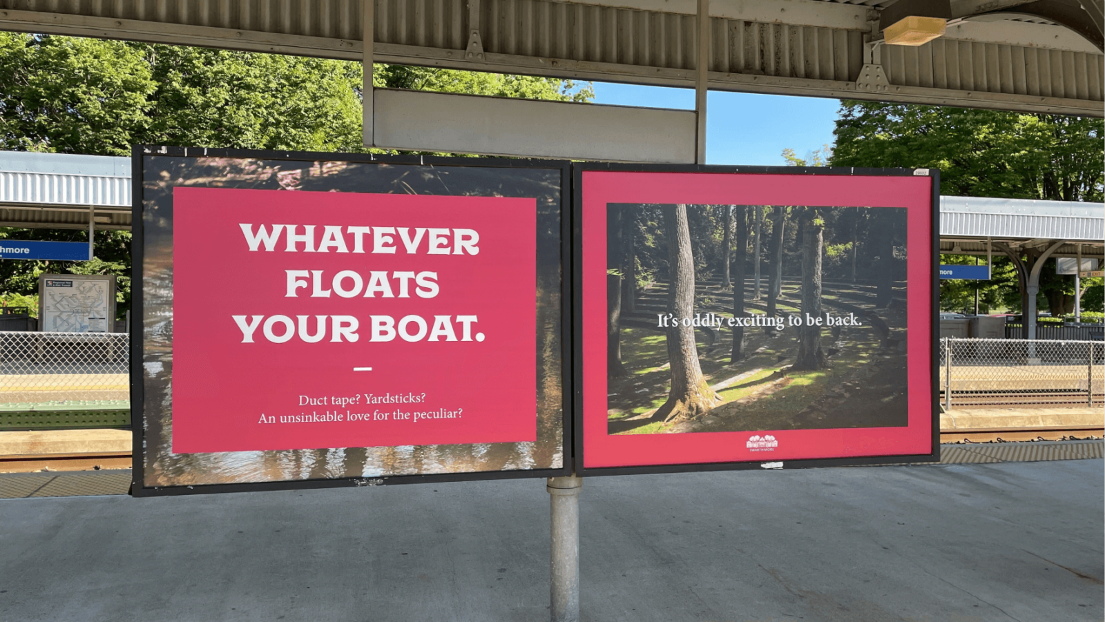
Prior to digging deep into a strategy phase, this Welcome Back campaign was all about deep cuts to get people excited about returning to campus in the fall with a wink and a nod to favorite “Swattie-isms.”
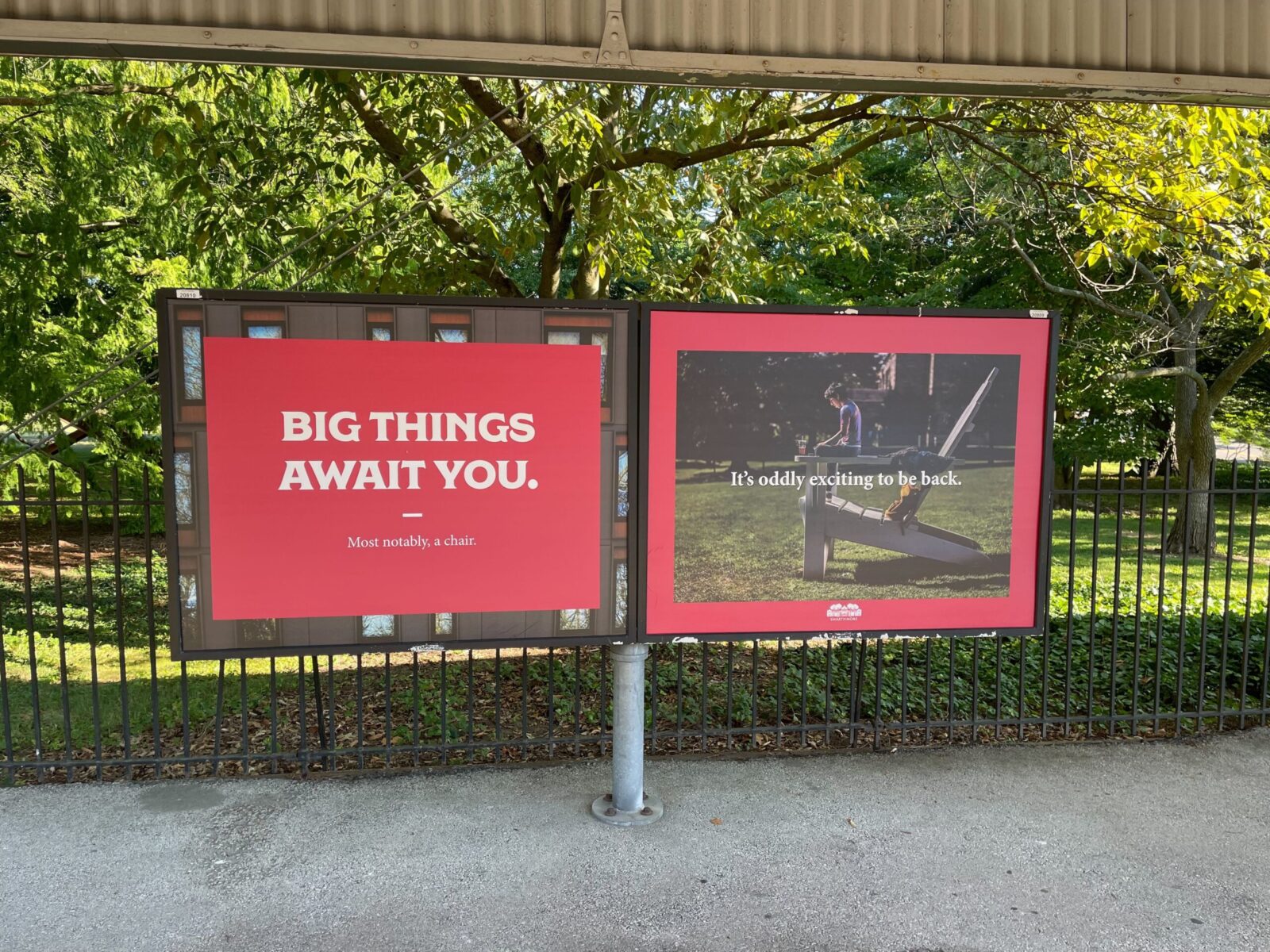
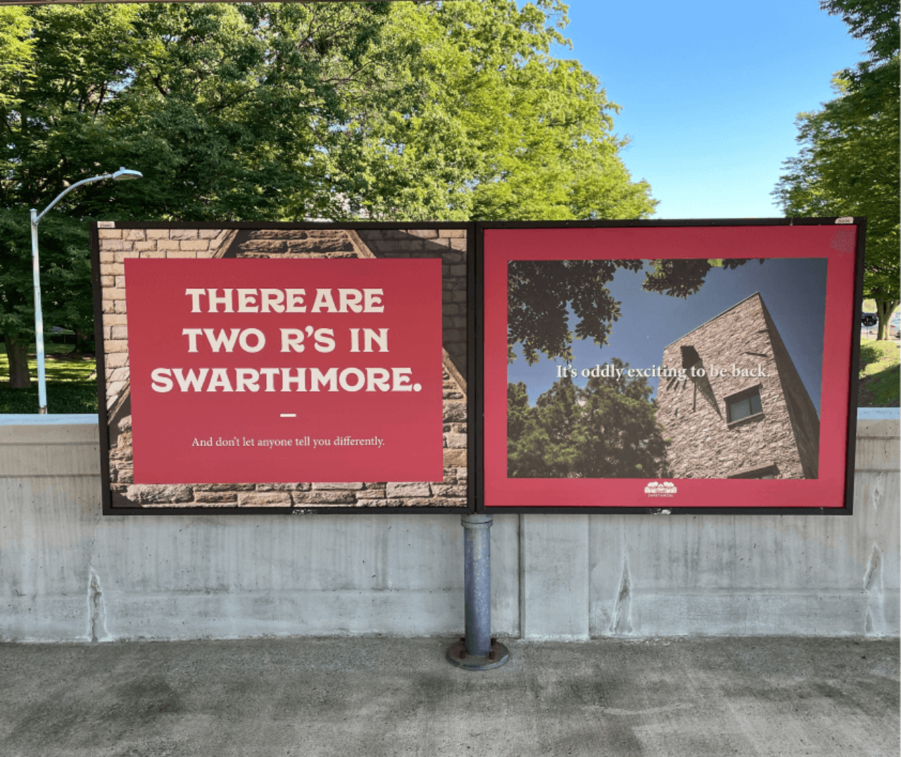
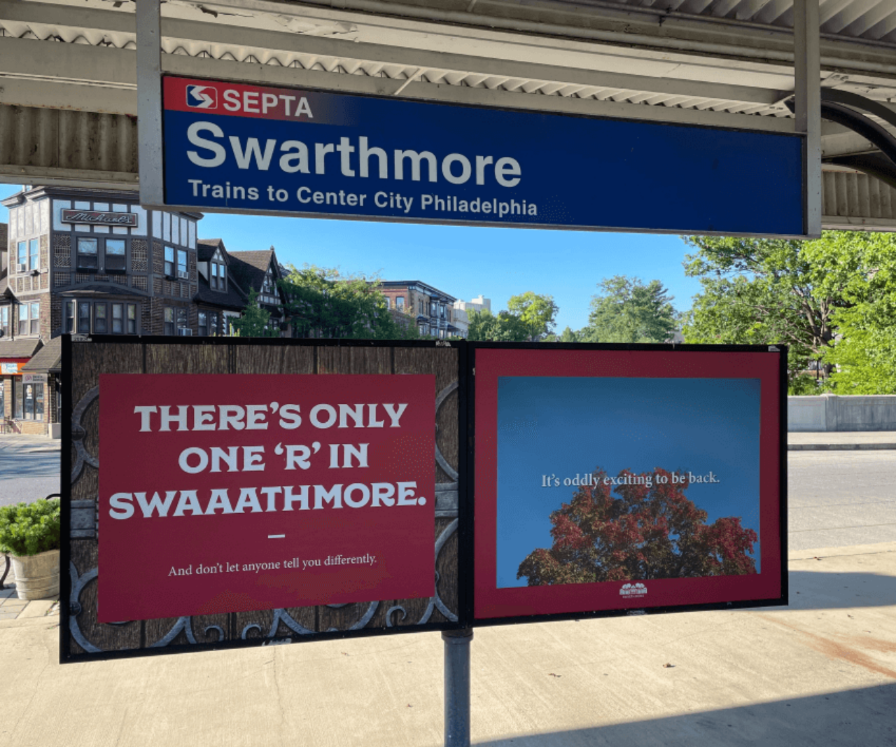
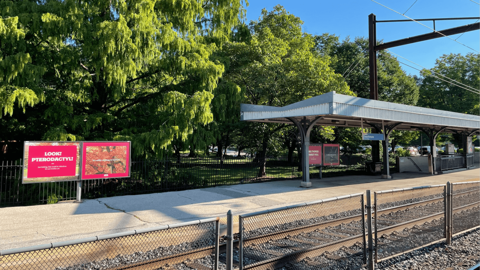
“These are great. Unfortunately, I only understand half of them.”
— T&C Creative Director

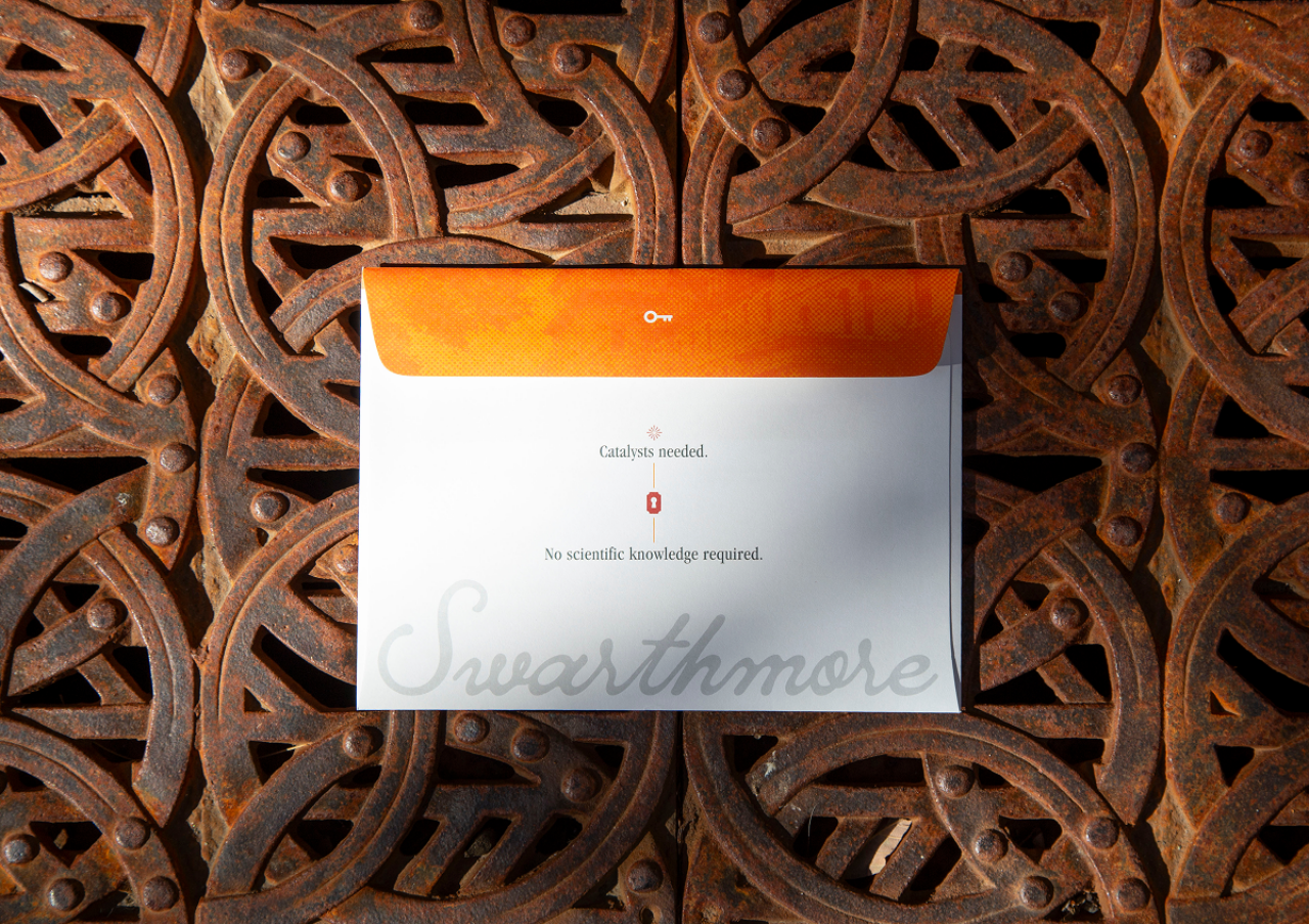
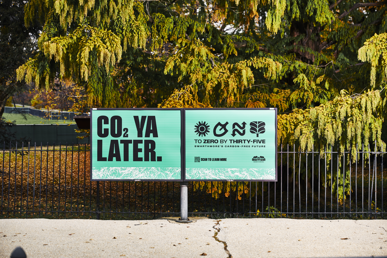
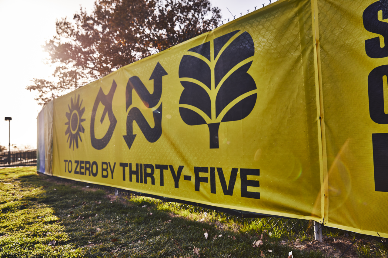
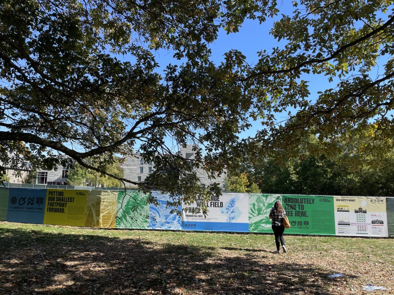
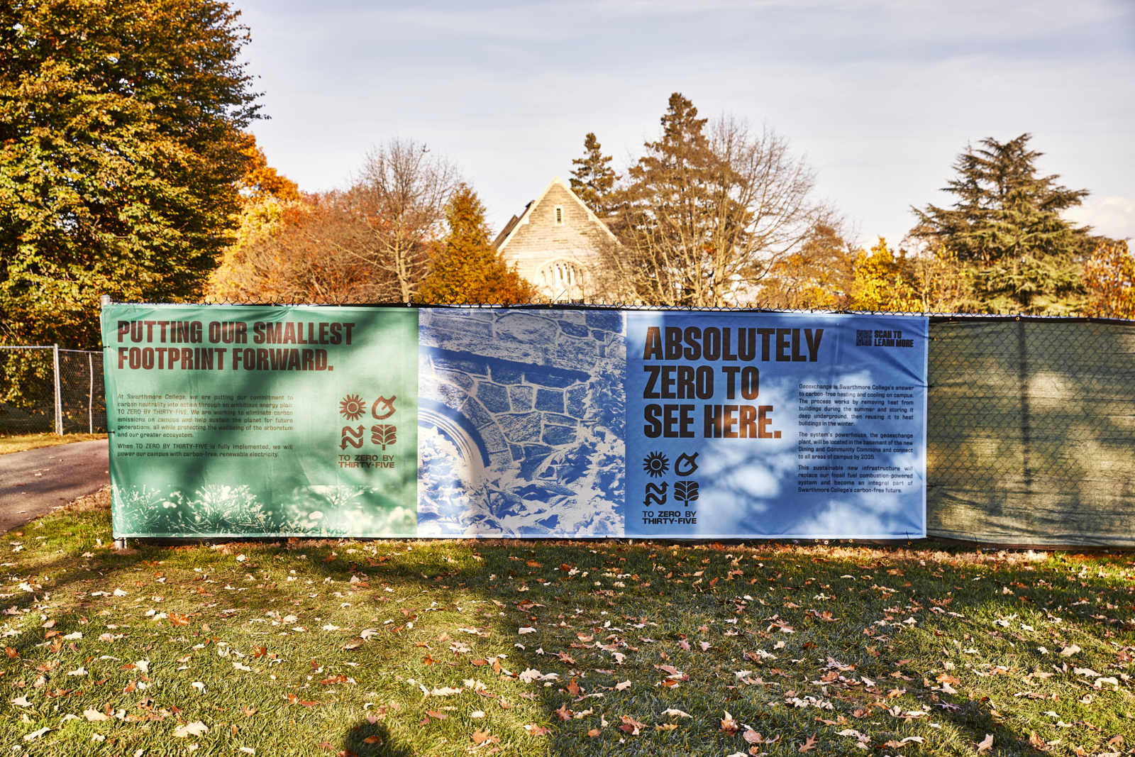
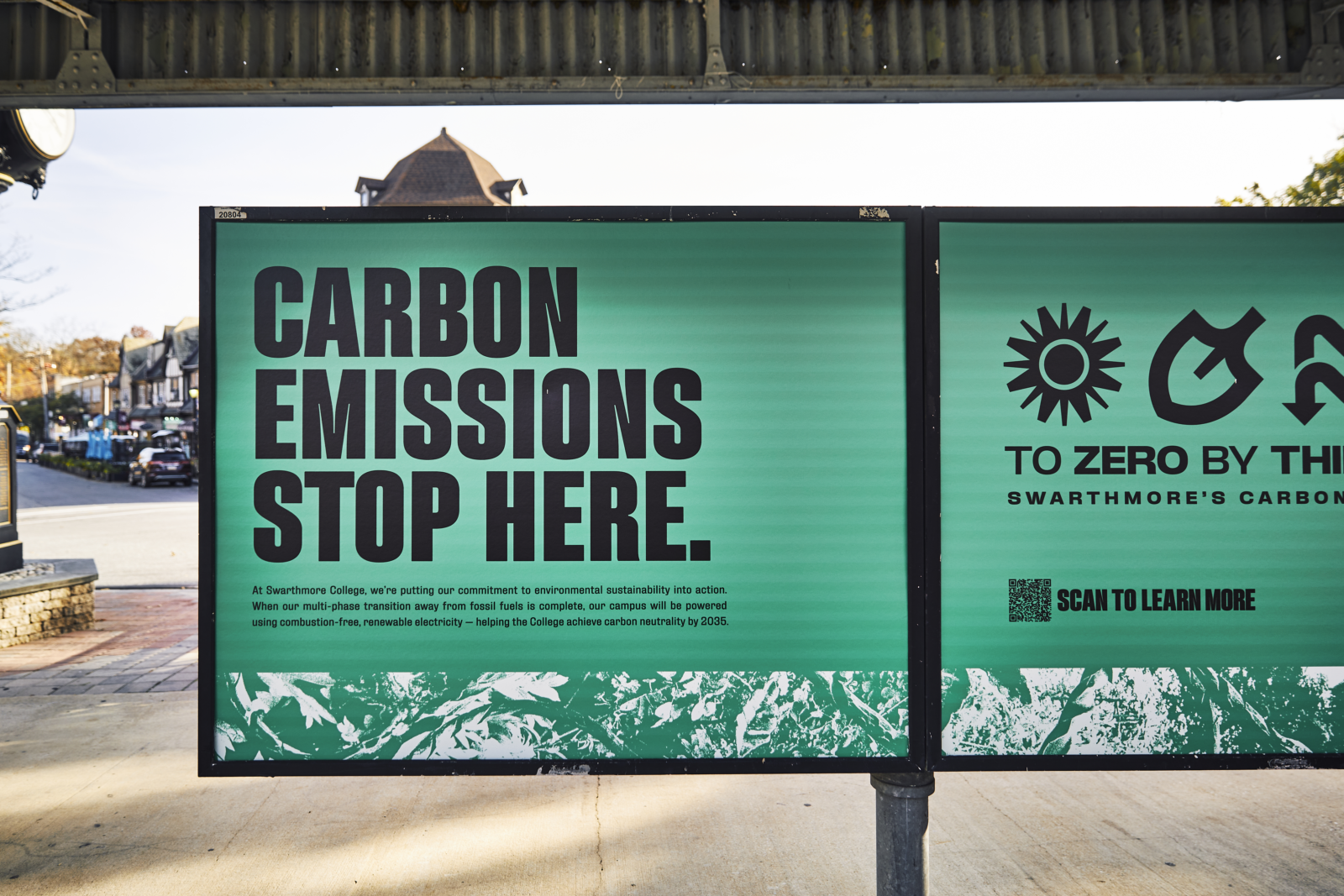
TO ZERO BY THIRTY-FIVE (20X35)
Swarthmore had recently approved an energy plan that would bring the campus to carbon neutrality by 2035. Now they needed a way to tell that story—and explain why one of the most beautiful campuses in the country looked like a construction zone. Fortunately, a strong brand can help guide you through challenging times. T&C helped launch the plan (initially called “Roadmap to Zero Carbon”) with a new name, a logo, messaging guidelines, campus signage, and SEPTA campaign.
RESULTS
The brand is working!
We demonstrated the power of strong branding to the branding-averse. A year into our partnership, the results were in. Only halfway through their annual admissions cycle, students were responding to admissions materials recreated in the new brand at a rate that exceeded the responses from the entire cycle the year prior. This new brand was established, then re-established again and again—across advancement, athletics, campus improvements, and more to help Swarthmore embrace a look and feel as consistent and adaptable as a Swarthmore education. We’re excited to see how it serves the College for years to come.