Colby College
T&C was instrumental in helping us craft a digital experience that reflects the excellence of a Colby education and meets the needs of today’s audience.
Andrew Herrmann, Director of Digital Strategy, Colby College
Stop us if you’ve heard this before, “The .EDU is the primary destination for all our audiences.” Our discovery process revealed that for Colby College, this wasn’t entirely true. For many users, in particular discerning prospective students, the site was just one stop that informed their perceptions of the college. Seems obvious, but what wasn’t was finding out what would be most beneficial to our users.
View site: Colby College

Rather than be dazzled by gizmos, our users wanted utility and substance. Instead of an archive or a bloated diner menu of options, we wanted to build a tool, and through its usefulness, create a resource of enduring value.


To accomplish this, we identified the content that was most substantive and relevant: Colby’s news and events, areas of academic distinction, and its people, to name a handful. Then we got out of the way. We designed a streamlined site that, while quite large, never feels that way.

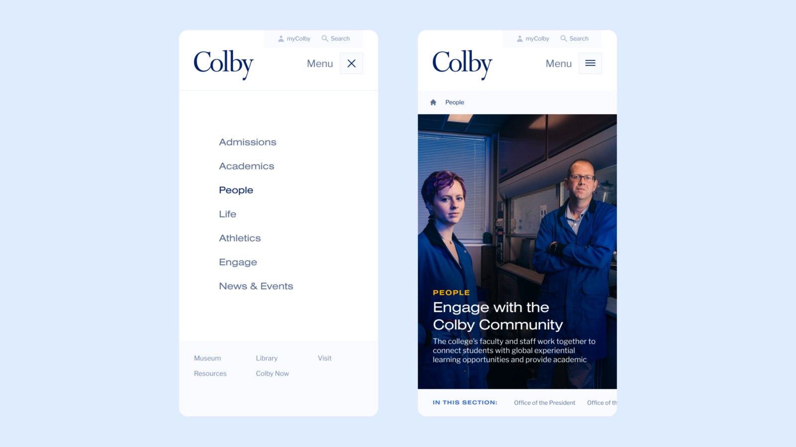
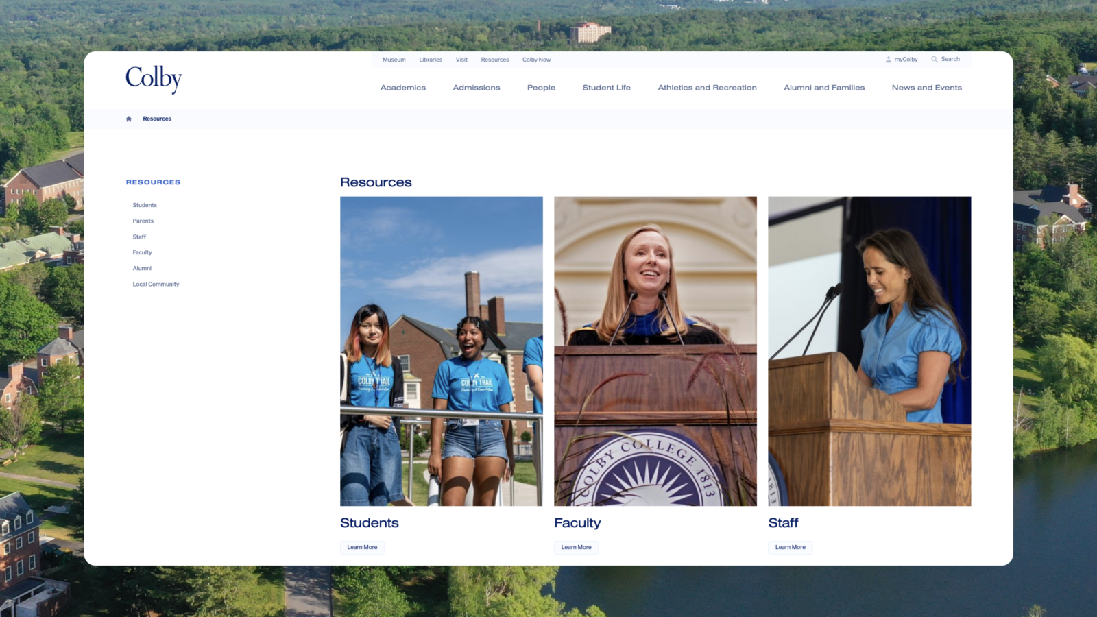
When it came to information architecture and development, we aimed to make what was ultimately a very large sitemap look, feel, and behave like a small, focused, streamlined one. We hunted down and purged vestigial content and carefully avoided overusing drop-down menus and sub-pages, which tank adaptability and guarantee that even the most modern site will eventually gather dust. With self-populating navigation, we ensured that administrators at Colby will be able to make elegant updates not if, but when they need to.


While it may make for a better story to say we did this all ourselves, the truth is we had a thoughtful and talented team to work alongside at Colby. They brought the perspective of administrators, developers, and third party providers to the table that enabled us to build a highly functional (and beautiful) tool—together.