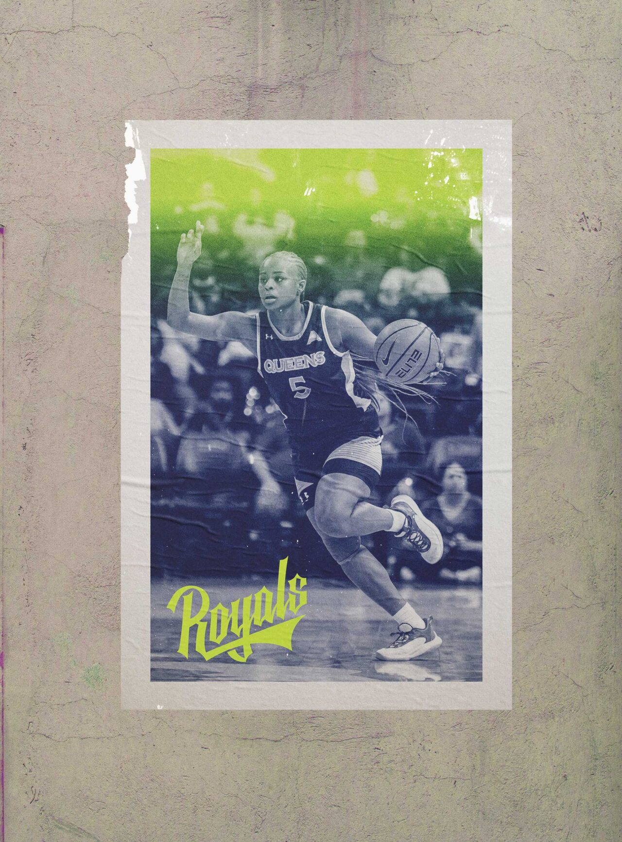
Queens University Athletics
A brand(ed) new season.
It’s one thing to play like you belong in D1 of the NCAA. It’s another to look like it. With more eyes on Queens University Charlotte’s newly crowned D1 program, it was time to give the nation something worth looking at. All hail the new Queens athletic brand.
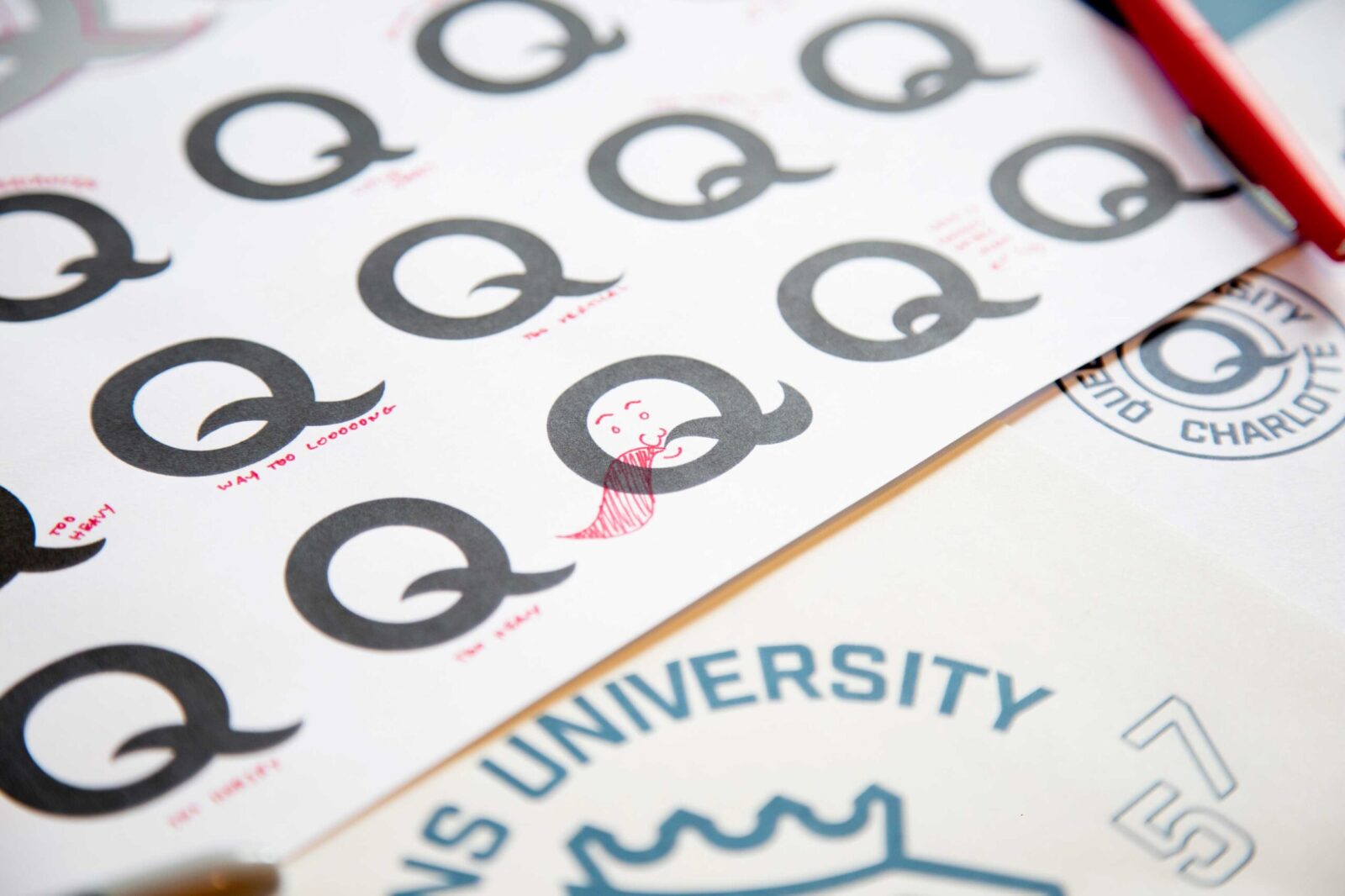
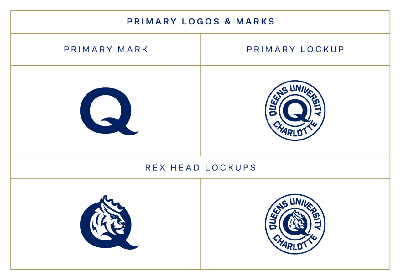
We began by developing a primary mark that could work for athletics and the university. Queens is one of only a few schools with a “Q” as the first letter in its name so deciding that it should be the centerpiece for the mark was easy. Not as easy, iterating on hundreds for Q’s to create something timeless.
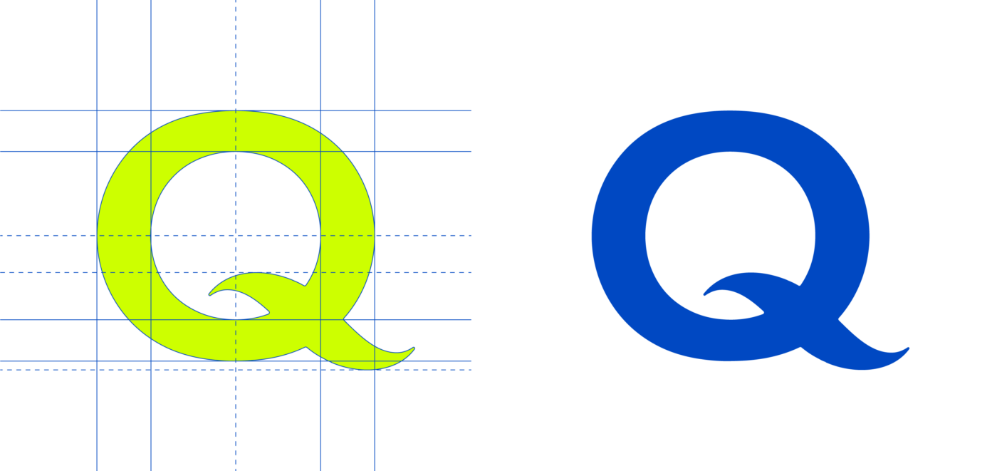
Rooted in history and made for the here and now
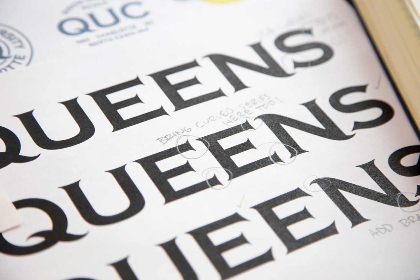
One of the most challenging aspects of creating the mark was trying to achieve a result that looks like it could have been created when the school was established but also right for today. The result is a custom drawn letterform exuding heraldry and legacy, without sacrificing any of its contemporary edge.

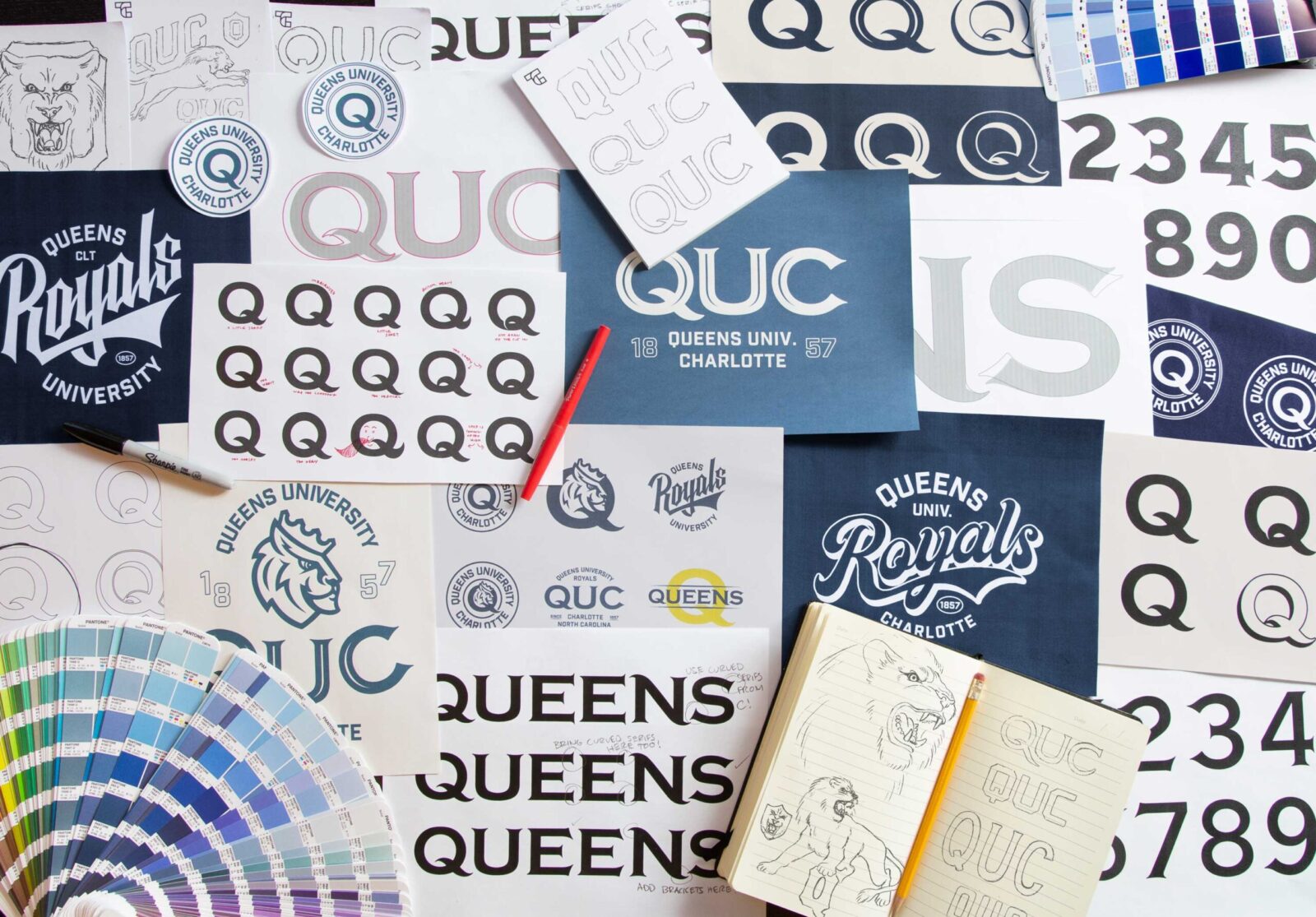
Once the Q was finalized as the primary mark we had another challenge. We learned in our research that the Queens mascot, Rex, is beloved by their community and had to remain a part of the athletics logo system. We had an eye towards that in creating the Q and through a lot of trial and error arrived at a harmonious solution.

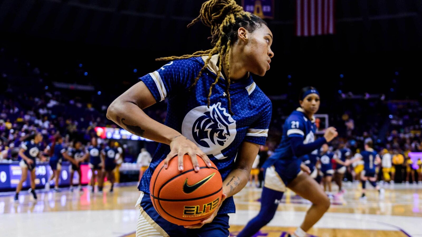
One of the most rewarding parts of this assignment was designing the basketball courts for the Queens Levine Center. The main court features the newly created Rex head Q combo at center court. The gradients that are used on the sidelines and in the paint are carried over from the institutional brand we developed. A signature look for Queens in their new D1 conference.

“It’s nearly impossible to read Queens on the ESPN ticker”
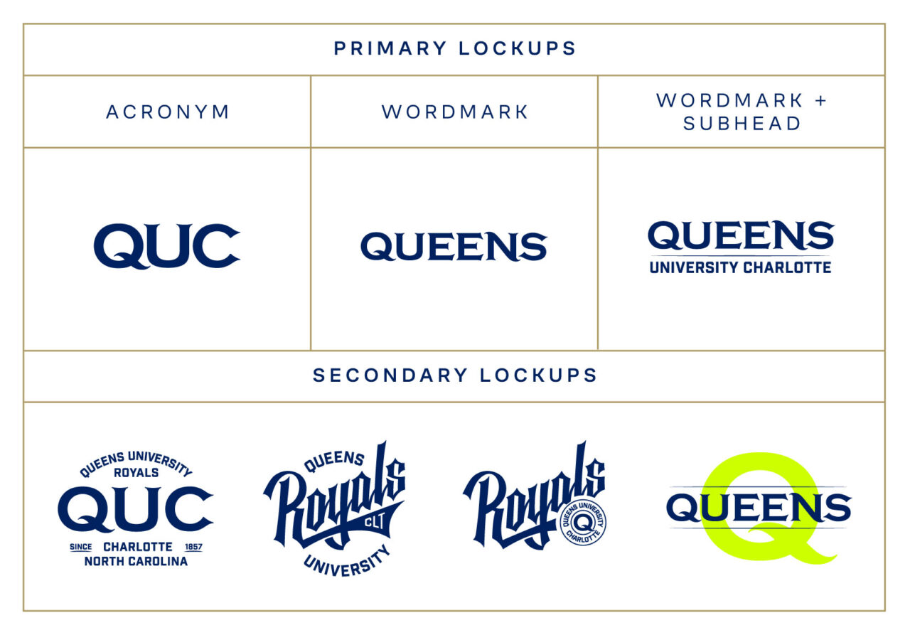
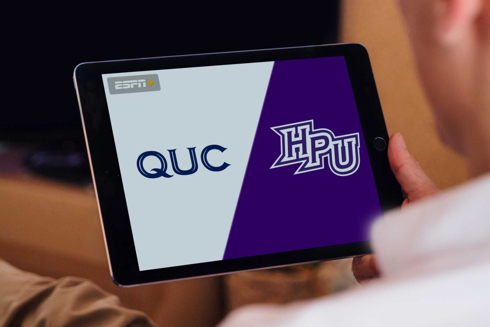
The move to D1 creates a new level of exposure for Queens. The only problem is, their existing athletics identity was not designed to show up on the likes of ESPN. We made the recommendation during our strategy phase that Queens embrace the acronym “QUC” for these instances. We began crafting a full alphabet that could be used for athletics.
We also created an in-line option of the QUC to really push that feeling of heraldry.
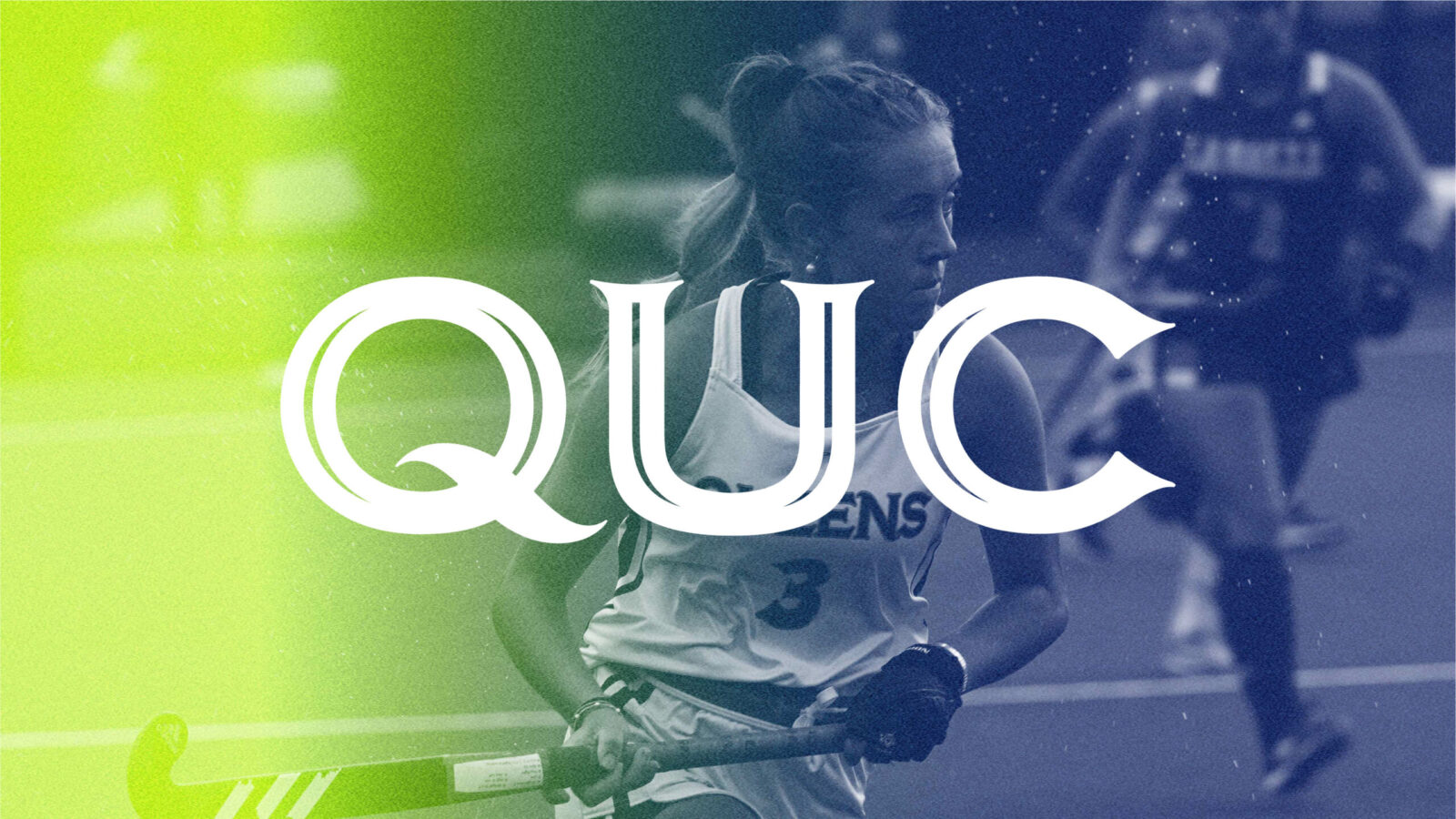
“We can use this everywhere.”
With the QUC firmly in place we tackled the characters for the full wordmark knowing that down the line this could transition to the primary logo for the university.

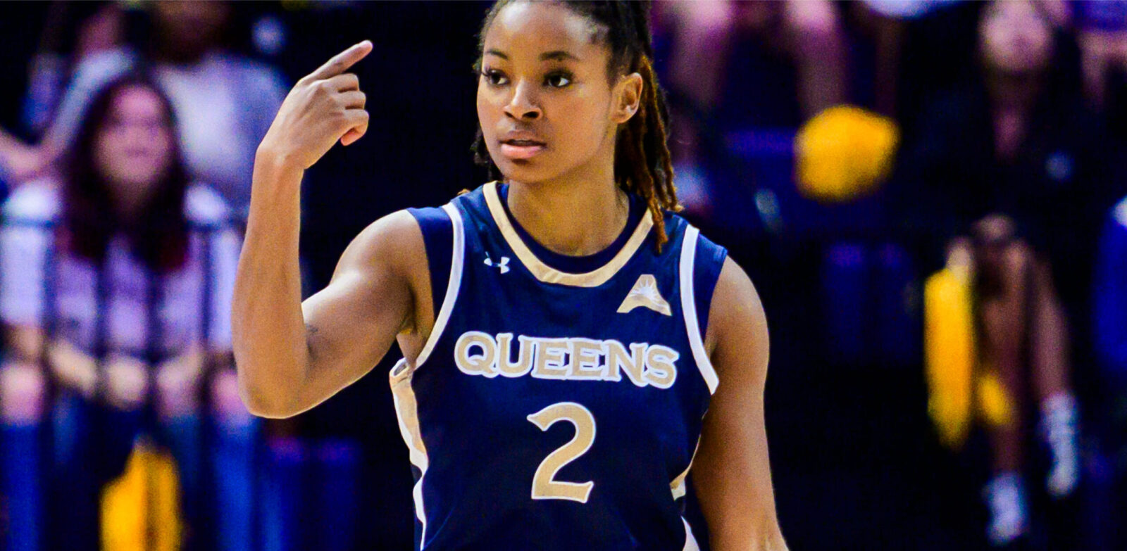
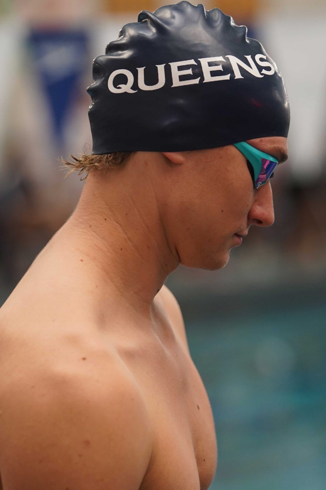
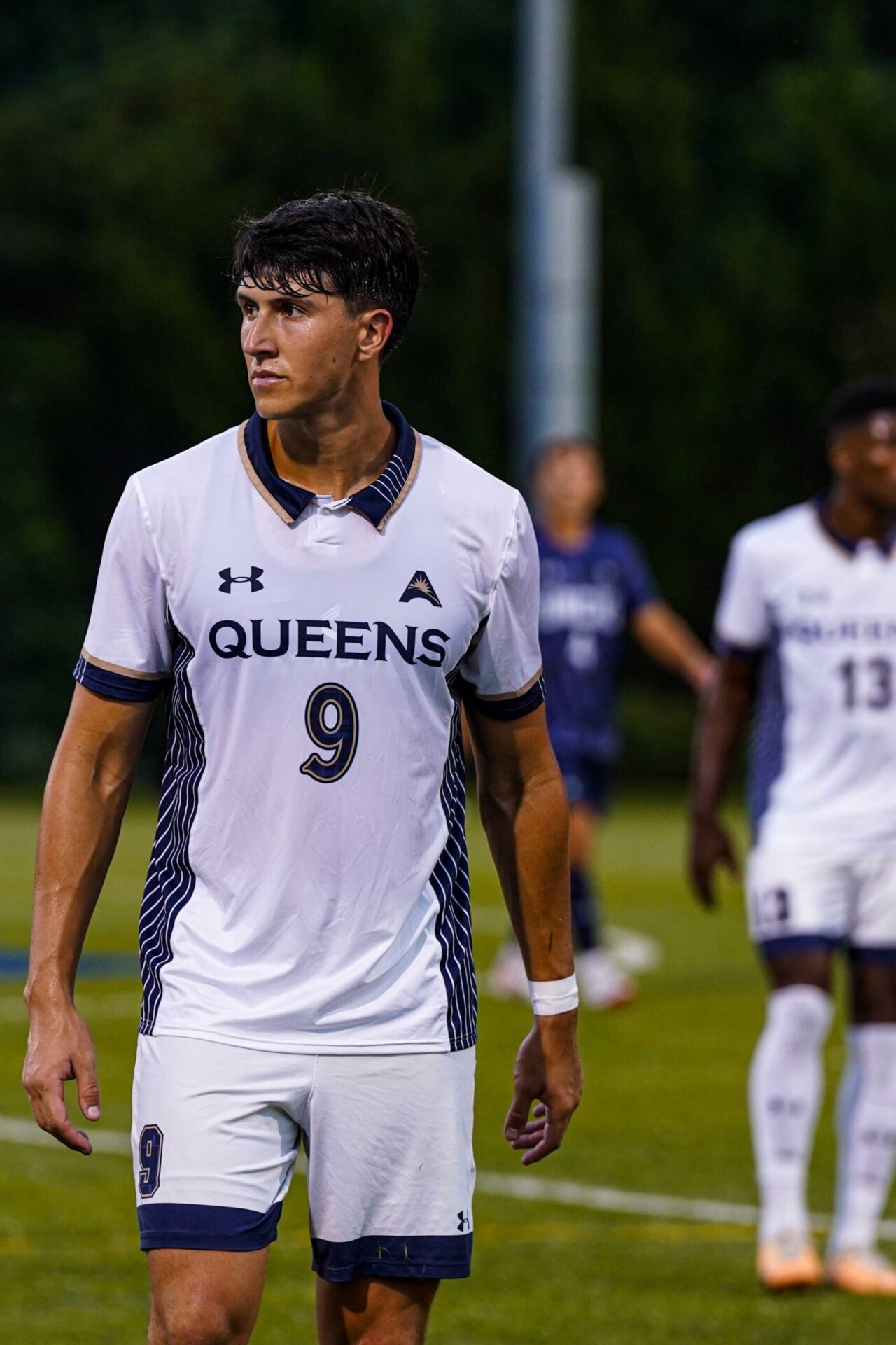
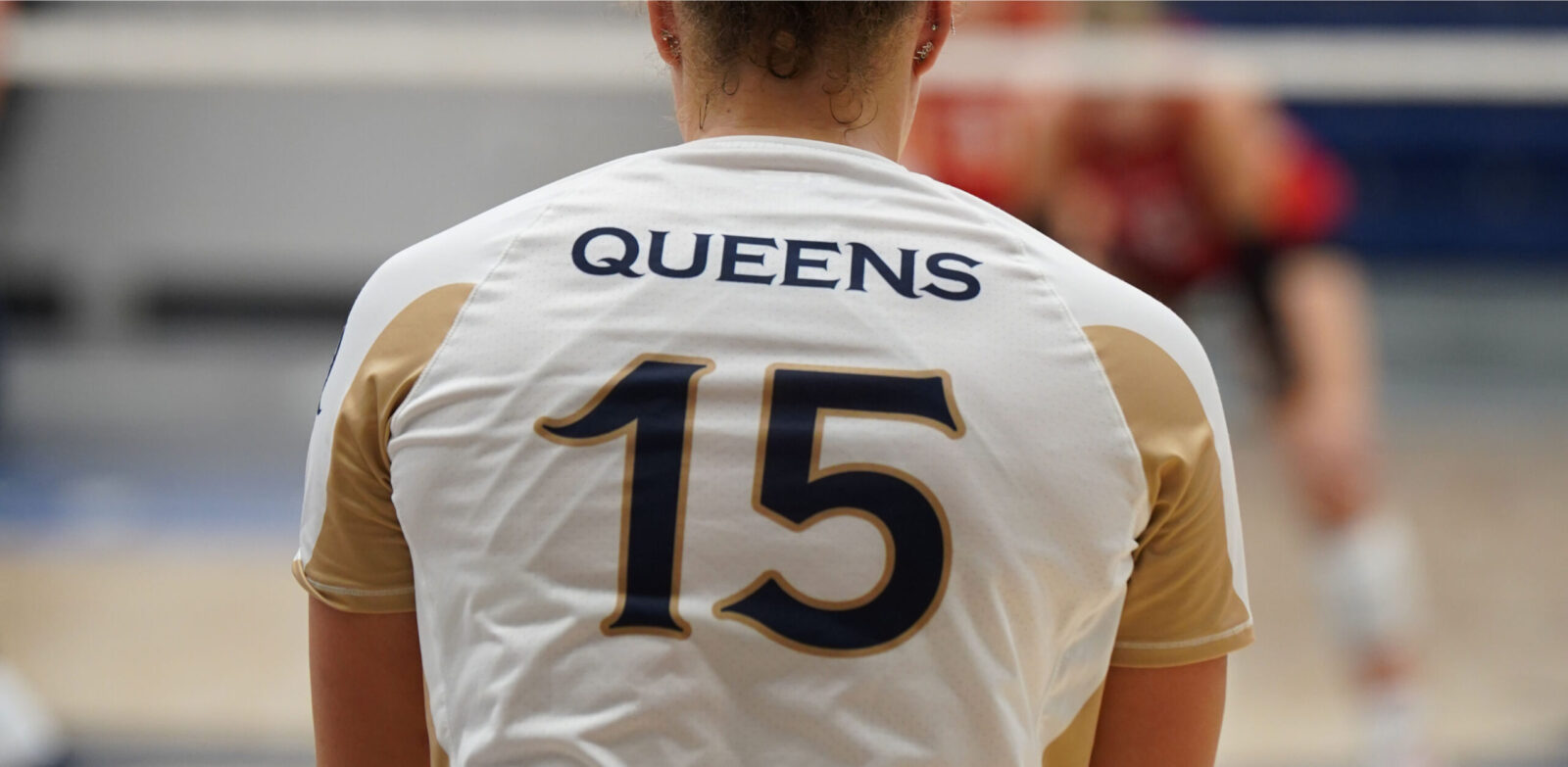
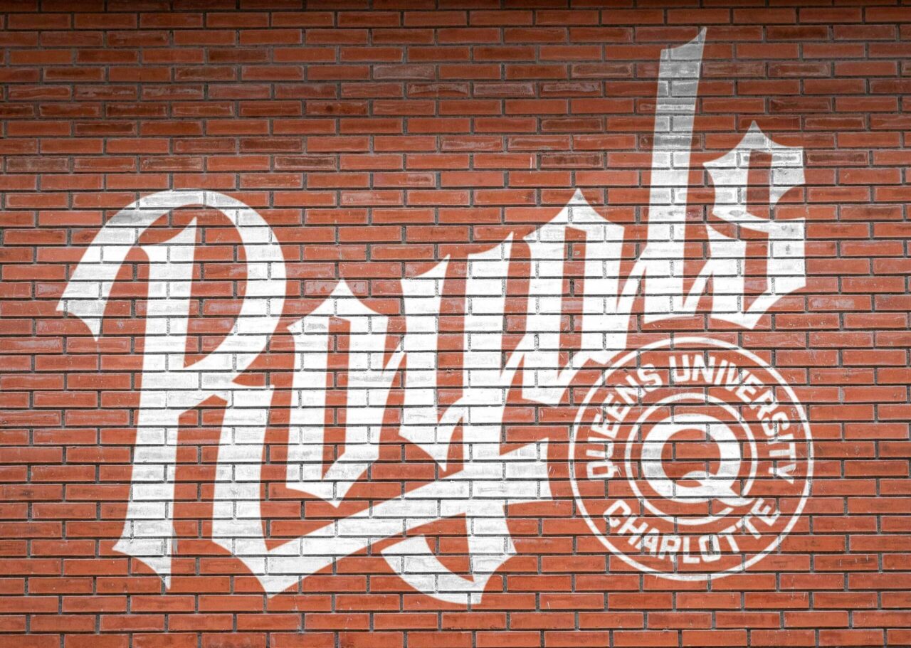
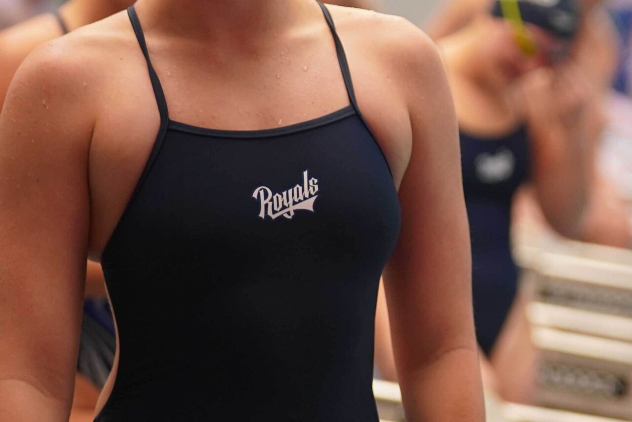
While the Q, QUC, and Queens would serve the vast majority of the university’s logo needs we learned in our research that there were other applications where secondary lock-ups were required. We were tasked with creating a a standalone wordmark for Royals.
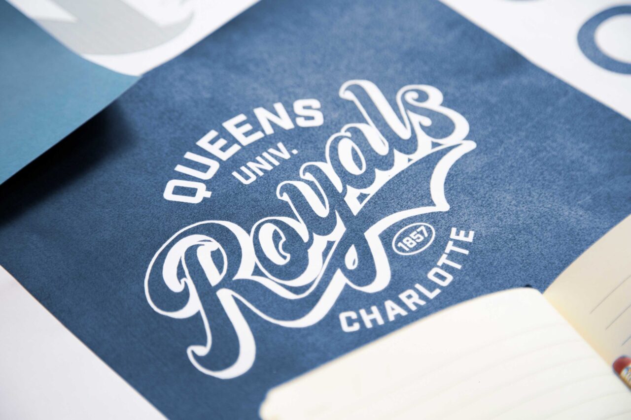
This iteration was left on the cutting room floor when we realized it was too similar to a certain major league baseball team.
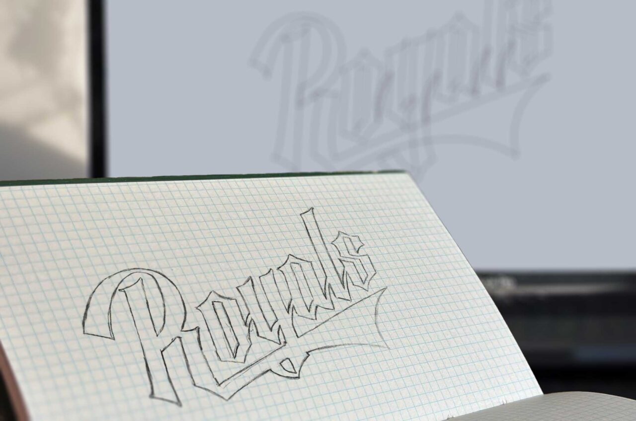
We landed on a sketch of a more electric version that we loved.

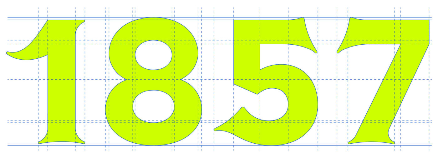
The move to D1 gave Queens the opportunity for another level of customization on their uniforms. We couldn’t resist the thought of creating numerals so we gave them the royal treatment and created three different weights.

“We’re elevating everything!”
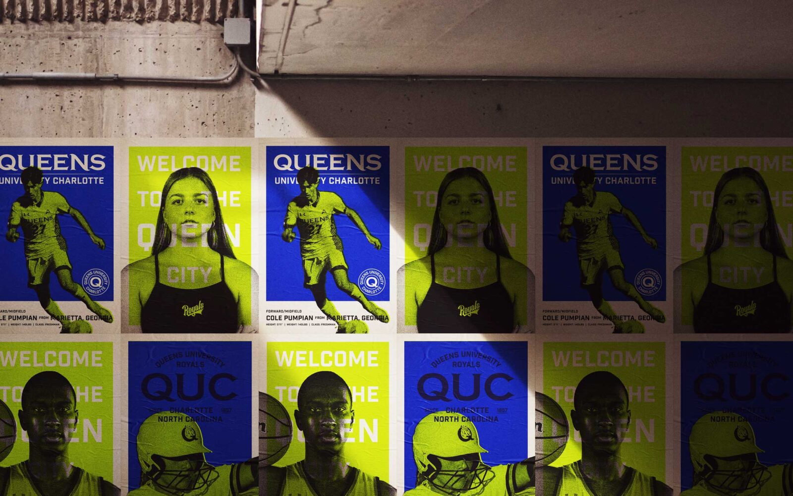
The only thing more rewarding than working on this was seeing the reactions of the student athletes as their uniforms and gear were unveiled. We may or may not have teared up the first time we saw this.
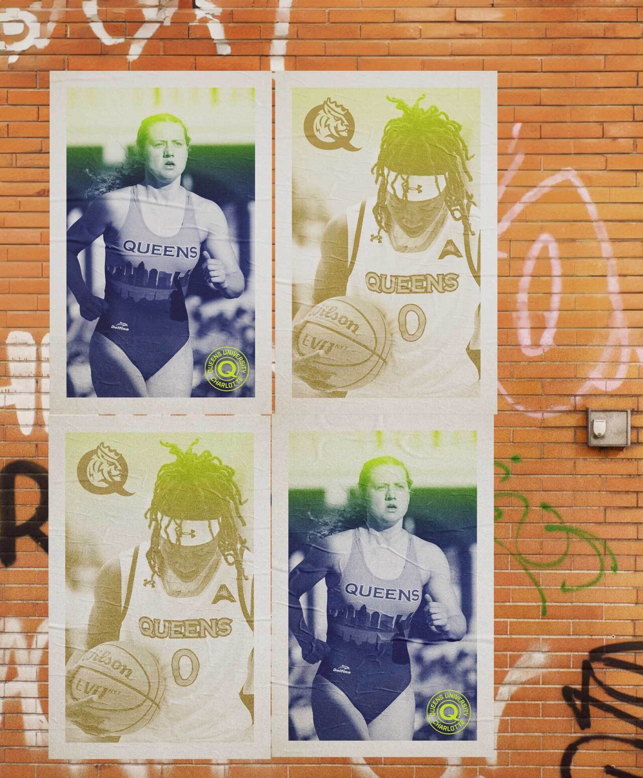
The end result is full logo system tailor made to support the needs of the entire university. Built for maximum versatility, and innumerable applications the logo suite has enabled Queens to show-up in a unified way. Furthermore, it has created a sense of pride and excitement for the community as it continues its ascent to D1 and beyond.
