Productside
Our name and identity made sense 15 years and three offices ago.
When 280 Group took a look into the metaphorical mirror, what they saw didn’t reflect how they felt. Their offerings had evolved, and they needed a new name, tagline, logo, and branding to show how they were a leader in product management training and consulting.
That’s where we came in. Like a worm in a cocoon, we helped their brand transform into the cool, witty, sophisticated product management butterfly they’ve always been by giving them a new name and look.
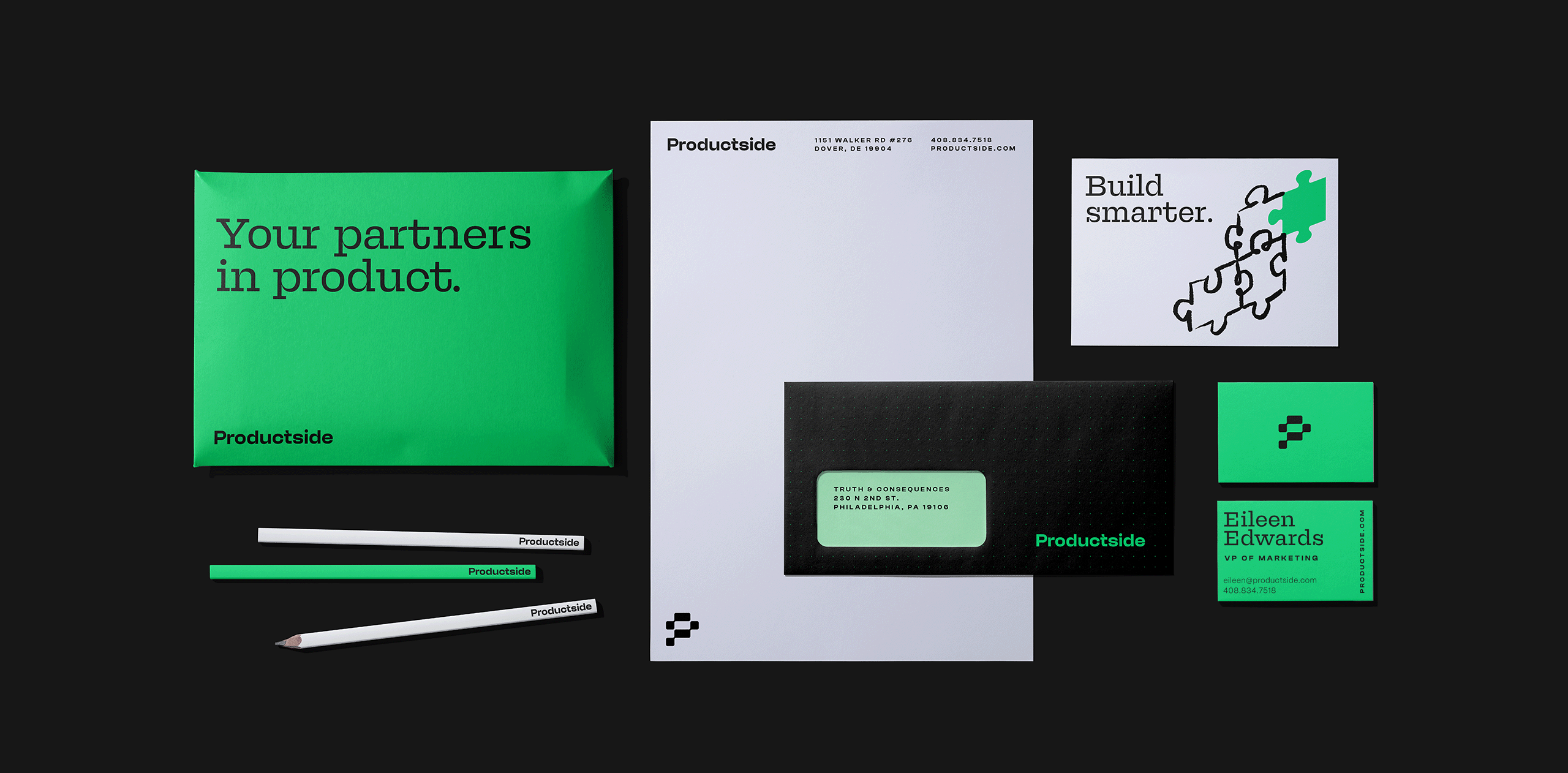
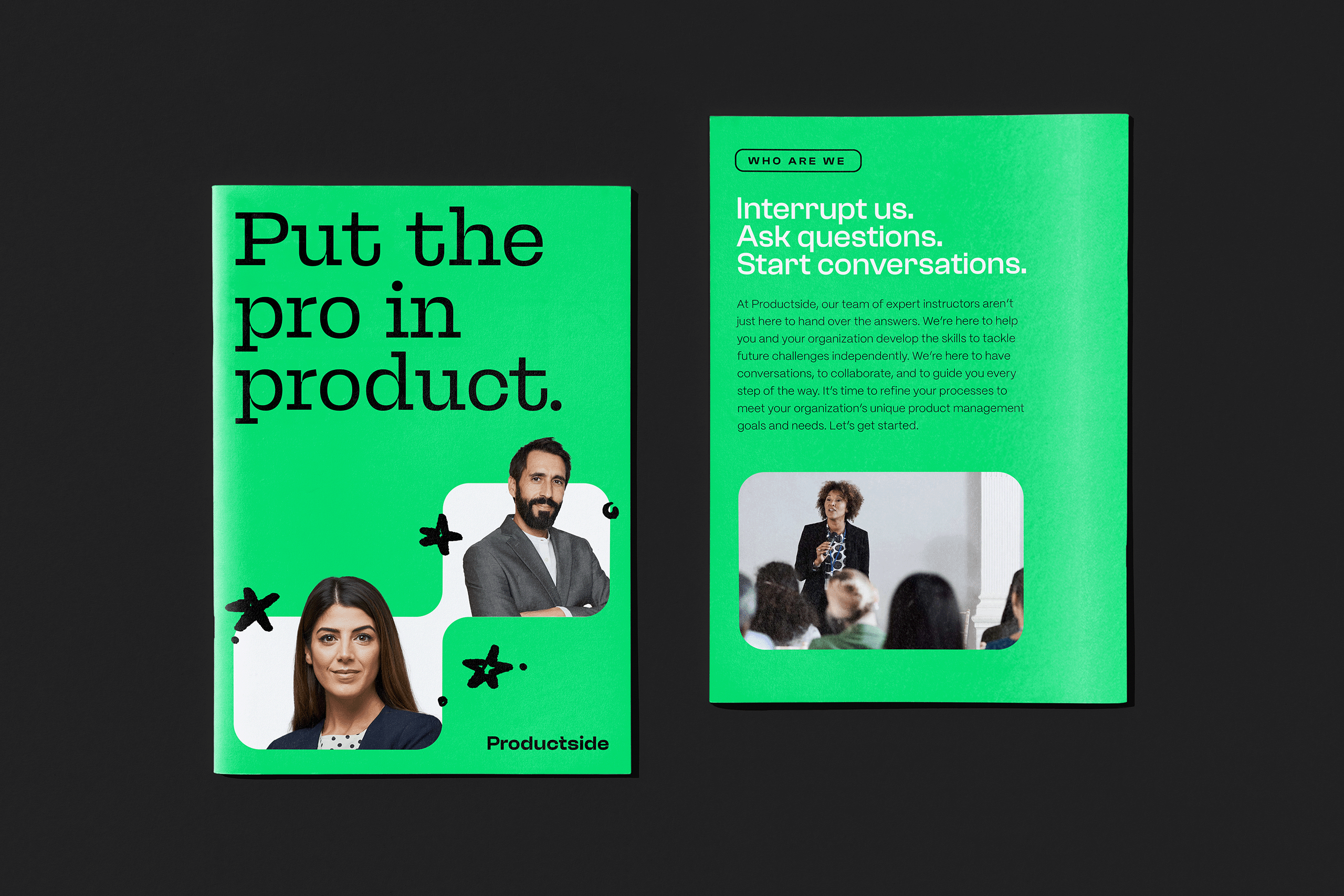
P for Proudofthisreallycoollogo. And also, Productside.
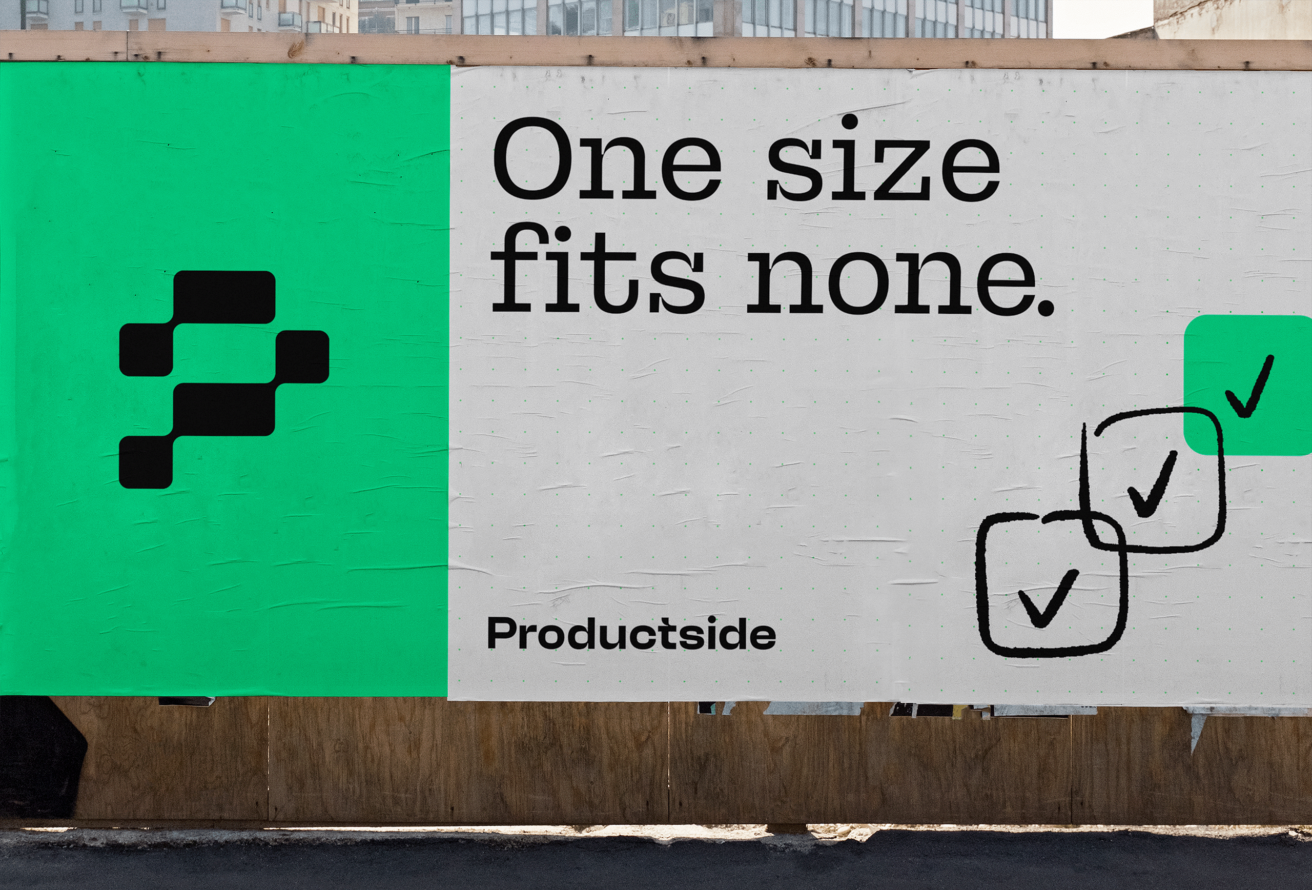
The logo was inspired by the product work flows used by product managers to communicate how they will accomplish their objectives — which was then formed into the shape of a “P” to further reinforce Productside’s name.


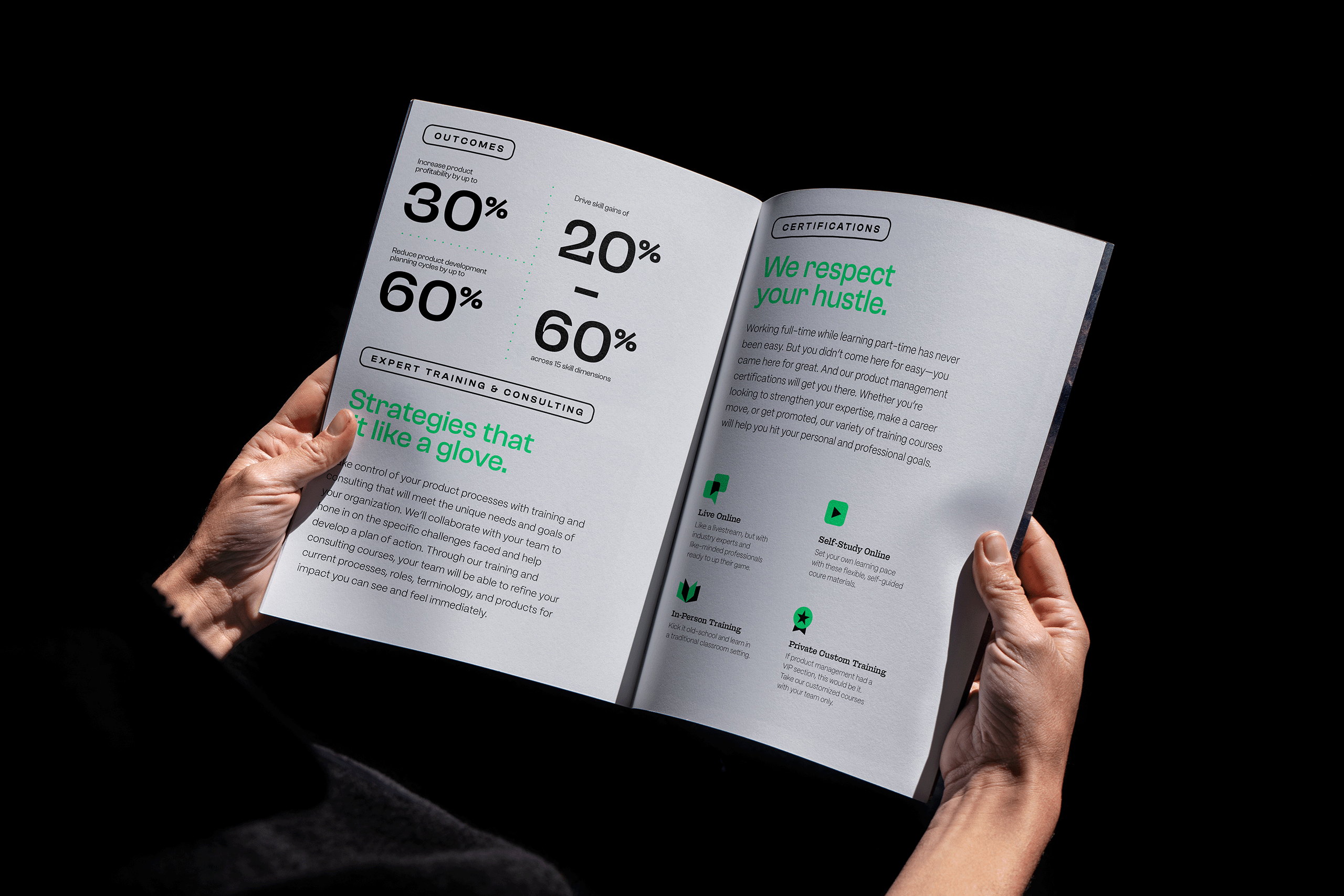
Instructional slides for product managers to use while lecturing.


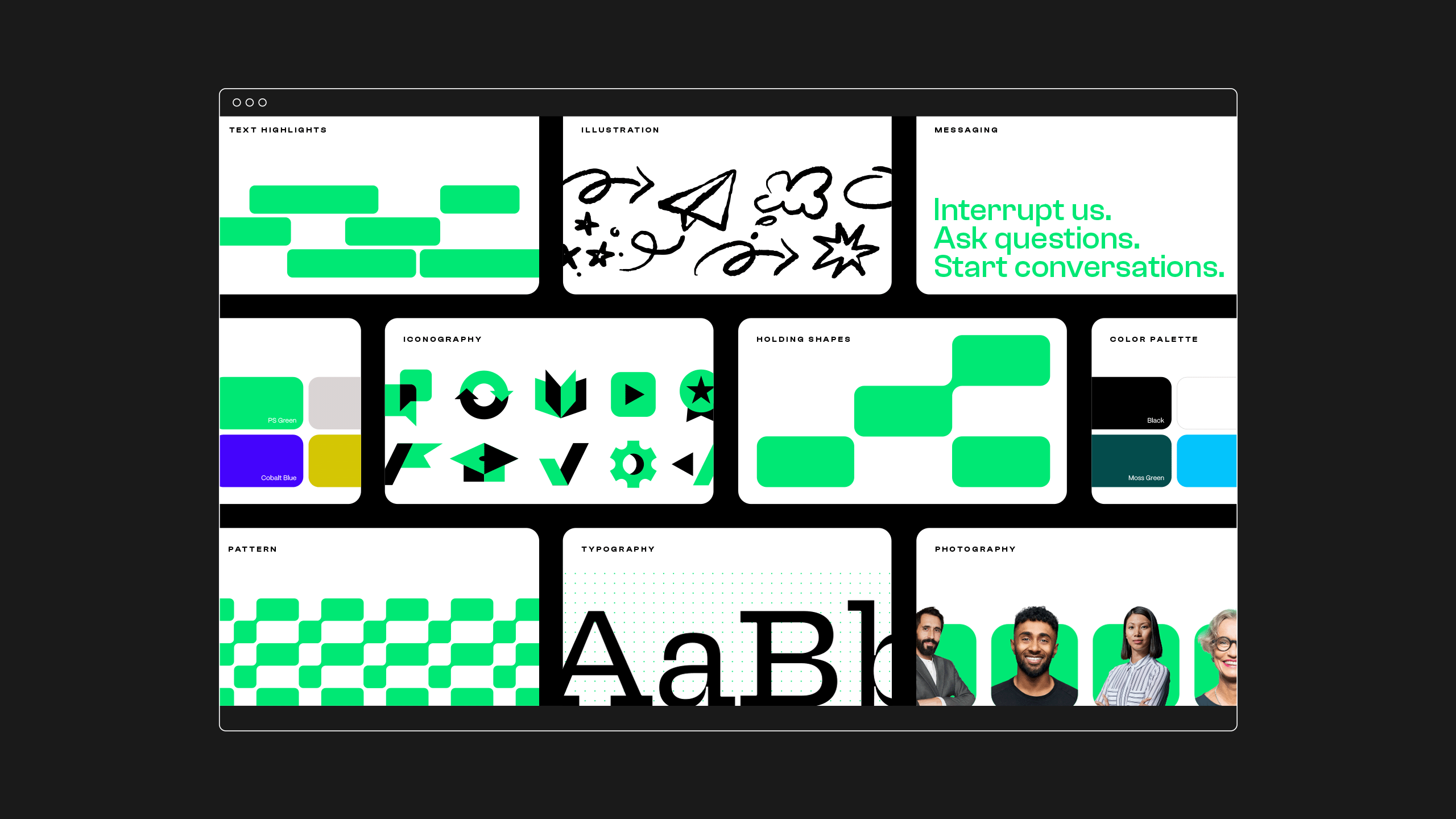
After carefully studying competitors in the product management space, we created a distinct, bold primary color palette of green, white, black, and gray to help Productside cut through the competition.

Additionally, we developed an equally eye-catching secondary color palette for their course materials consisting of yellow, dark green, cyan, and indigo.
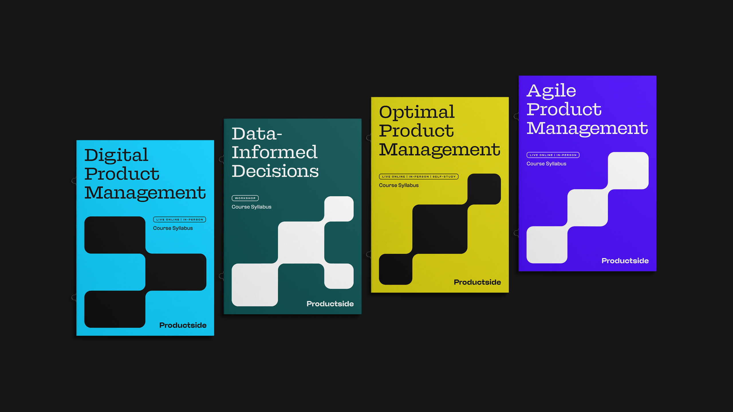
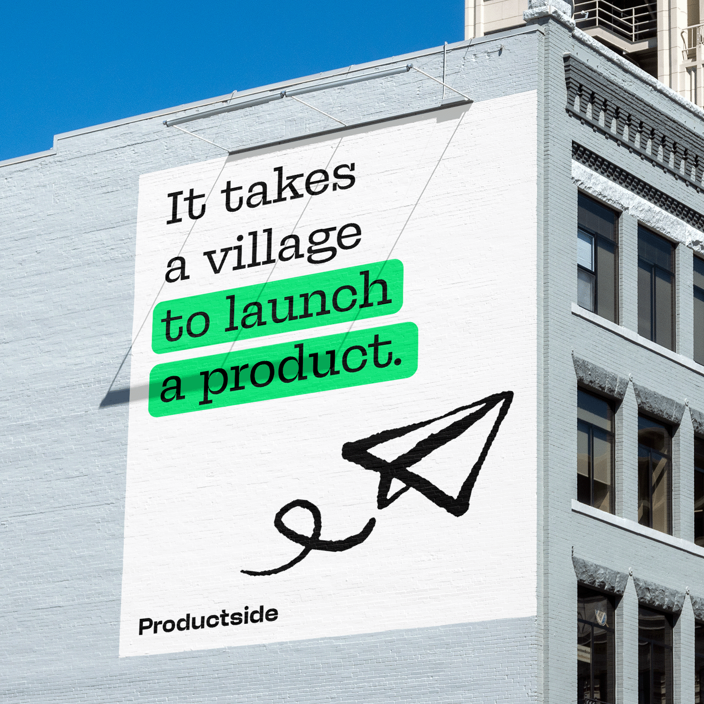
The typography was developed to reflect Productside’s intelligence and innovation. While its graphic elements, like hand-drawn illustrations, were made to bring a more personal touch and sense of humanity to the brand.
RESULTS
And that’s all, folks.
Sometimes the best ending is the one where your work makes a group of product managers so happy that they say things like “LOVE,” “it has life!” or our personal, totally objective favorite “you are all really good at what you do.” To that we say, you are too, Productside—and now future PMs everywhere can see it.